
Museum Presentation for Pigment Inkjet Prints
Peter C. Fisher • 2025
Conservation practices for printing, framing, and display
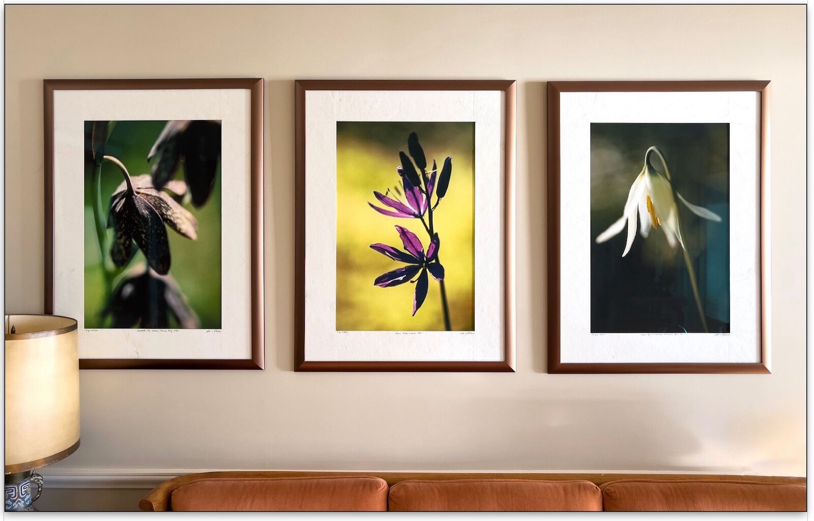
As a printer and framer who prioritizes top-quality materials and museum-level presentation for my artwork, I want the customer—and future owners—to be fully informed about what they are purchasing or framing. This article offers a set of best practices for those interested in a practical approach to presenting their art on paper to museum standards. The future will thank you for your foresight in this matter!
The goal is to create a protective, beautiful presentation, one that will provide maximum enjoyment to art lovers, and maximum longevity for the print. All color inks and paints fade over time when exposed to light (some also fade in the dark), but aqueous, pigment-based ink sets have achieved remarkable lifespans, as we shall see in the section on Wilhelm Imaging Research concerning lightfastness.
I have focused in this article on the conservation requirements for framing pigment inkjet prints on paper; but the principles may apply to other paper art.
.
Print with wide borders when using overmats and non-adhesive mounting
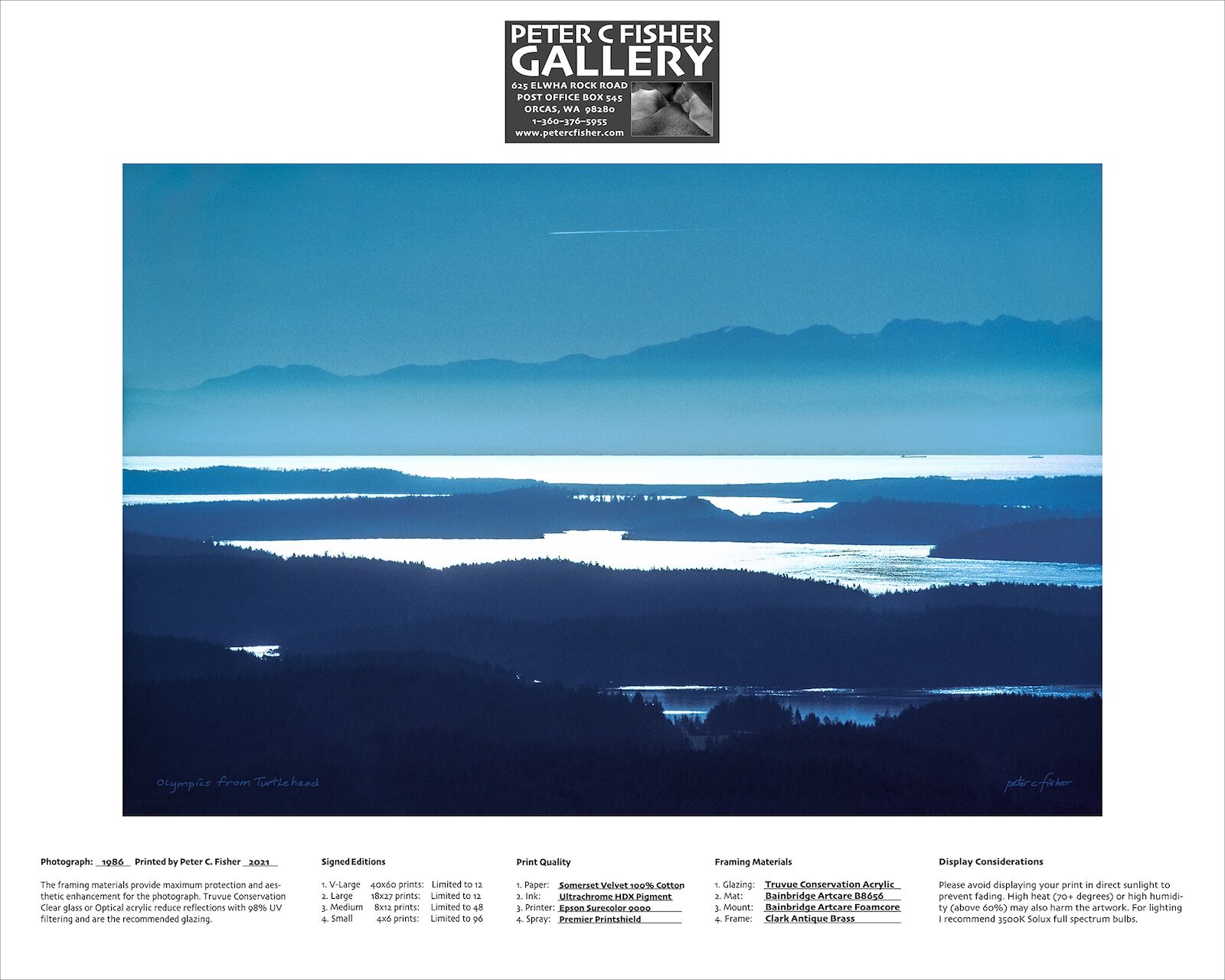
The first practice I recommend is to print with wide borders. There are several advantages to printing a 4x6-inch print on a 6x8-inch template, as shown in the image above. A 1-inch border on small prints, a 1-1/2 or 2-inch border on 8x12-inch prints, and 3-inch borders on 18x27-inch prints, allows the window mat to physically restrain the print and keep it flat in the frame. Window mats hold the artwork away from the glazing. An inkjet print in contact with glass or acrylic glazing is vulnerable to moisture damage, ink transfer, or adhesion. (The print and glazing can stick together.)
The second advantage to wide borders and proper framing is that they reduce the attacks atmospheric pollutants make on artworks on paper, which occur from both the image side, and cut edges, of the piece. Depending on the age of a print, and where and how it was displayed, there may be visible ozone or acidic gas damage absorbed on all sides of the piece. I once displayed a framed print in a restaurant and within two years the indoor air pollution from cooking had visibly discolored the mat board from the edges inward.
Sufficient borders also make it easy to use corner pockets or mounting strips to safely hold artwork to the backing board without the use of glues or adhesives. The print can be removed and reinstalled as needed when repairing damage or reframing.
Instead of inserting the corners of the print all the way into the corner mounts, leave a 1/32" to 1/16" gap to allow for paper expansion on small to medium-size prints. When framing 8x12-inch prints (printed on 12x15-inch paper) in a 16x20-inch frame, I use four 1-1/4-inch corner mounts. For large-size, 18x27-inch prints on 24x32-inch paper, I specify four 2-15/16-inch corner pockets and four mounting strips.
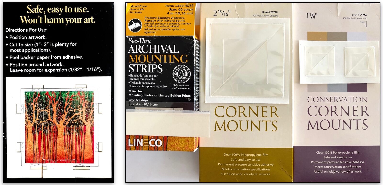
Corner mount and mounting strip options
The third reason for printing with wide borders relates to handling. Inkjet papers, while often fairly thick, are not designed for strength—they are engineered for one specific task: to accept coatings and pigments on their surface for superior color saturation and image sharpness.
While one may use nitrile gloves or an auxiliary support—it is best to never touch a pigment print—it is, never the less, easy to crease or deform a thick, cotton print, or to crack or crimp the surface through inappropriate handling. A wide border helps keep potential damage well away from the print area.
I print my largest 40x60-inch prints on 44x62-inch roll paper. When they come out of the printer, they land on a sloped tray to greatly reduce flexing of the print and eliminate handling almost entirely.
.
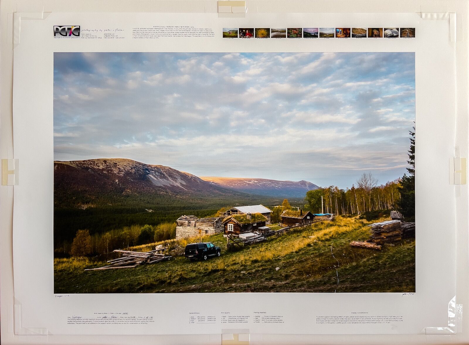
The Print Template: Product information for the owner and framer
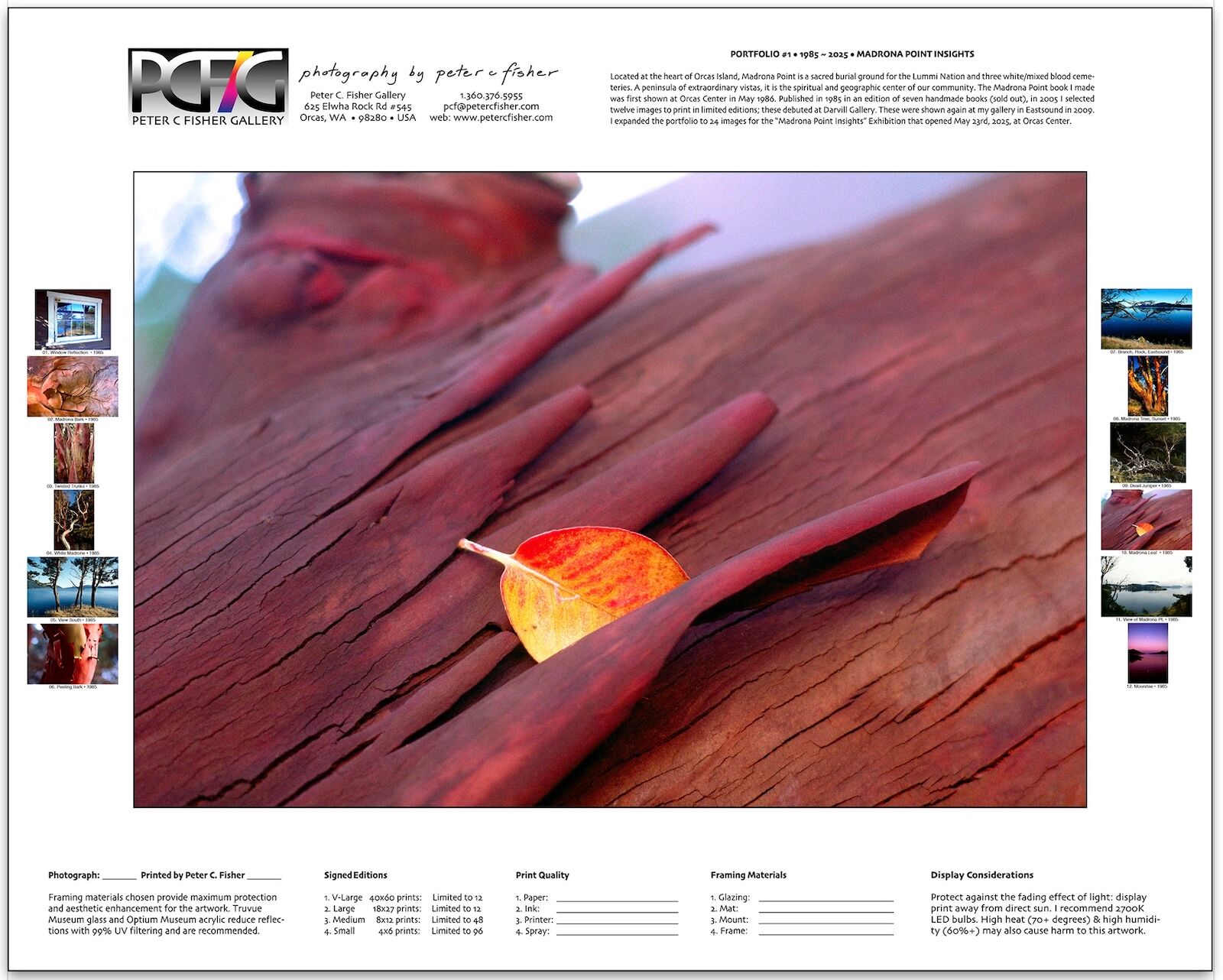
My print template which documents detailed information about the print as well as the image portfolio it belongs to
Some photographers market their prints without sharing with the purchaser useful details about what they have bought. There is a huge range of quality in terms of longevity and print appearance of the different printing technologies available: in addition to aqueous pigment prints, there are C-type chemical prints, dye-sublimation prints, solvent or UV-curable-ink prints, etc. I have developed a print template:

• Top left: my business address and contact info

• Top right: a description of the theme of the portfolio that image is a part of

• Bottom left: creation date and year printed; bottom right: display considerations

• Bottom center: signed-edition details, print and framing material
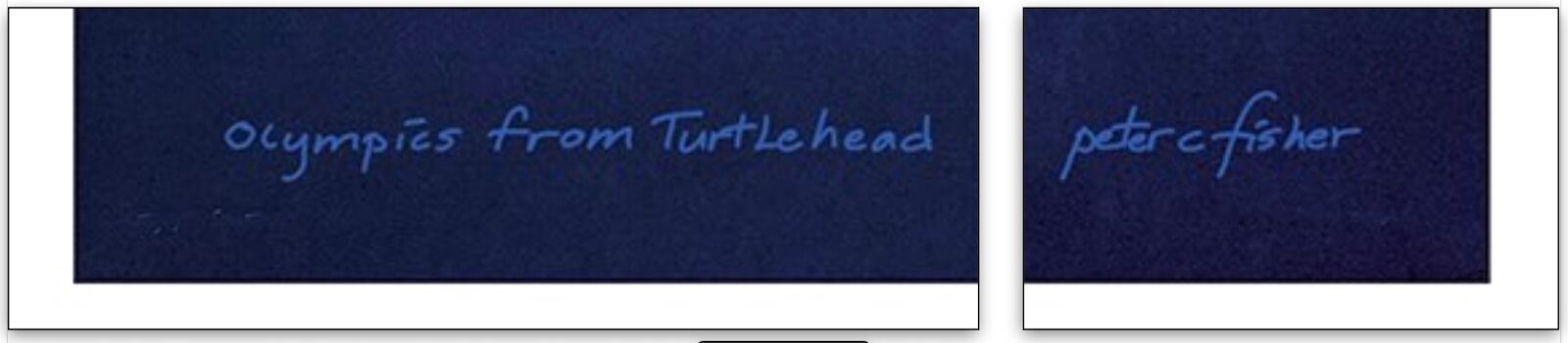
• The title is placed in the lower left and the signature in the lower right
.
The final touch is to show thumbnails of the 12 images in that particular portfolio on the side borders. (See image at the beginning of this section.) This helps put the artwork in context. I have standardized on portfolios containing twelve images, with some portfolios comprising multiple volumes.
Selecting and sequencing images is a skill that requires cultivating a sense for how to tell a visual story. To coherently guide the audience through an edited series of pictures it can be helpful to translate the classic literary organizing principles of intro, body, and conclusion into abstract or graphical ones. A portfolio’s organizing thread might be color, composition, location, time, or a theme or concept.
.
Epson Pigment Printers (Canon and HP also make excellent printers)
I have used Epson printers since 1995. They feature a proprietary technology for depositing ink drops onto the receiving surface. Here are some of the advantages of this technology.
An article by Johope Technology, a leading manufacturer and supplier of wide-format inkjet printer parts, states, “Piezoelectric inkjet printing technology has a stronger ability to control ink droplets, and the shape of the ink droplets is more regular, the positioning is more accurate, the printing resolution is higher, and high-precision printing is easily achieved. In addition, piezoelectric inkjet printing technology does not require heating of ink, and the ink will not undergo chemical changes due to heat, which expands the range of ink choices and extends the life of the inkjet print head.”
Wilhelm Imaging Research publishes tests results for the comparative longevity of prints made on different printers and papers under a variety of display conditions (tested as a bare print, or behind glass, or behind UV glass, etc).
In recent tests, HP’s Vivera inks have exhibited better lightfastness, but print within a reduced gamut compared to Epson and Canon inks, which are able offer a more expansive gamut do to their larger, more varied, ink sets. (Epson and Canon printers each have ten ink cartridges on board, while HP printers use only seven.)
I have never done a rigorous side-by-side print comparison to discern the strengths and weaknesses of each printer, but I have compared Epson and Canon prints of my historical maps which are mostly 32x40 inches. At normal viewing distances they are similar in overall print quality. One excellent feature I can attest to, given my many years of experience with Epson’s printers, is outstanding print-to-print consistency.
Once a decision is made about which printer to purchase the next choice is paper. There are a large variety of fine-art inkjet papers available. An artist needs to choose the characteristics of the paper to fit the content of the image and the intended market.
.
Factors in the selection of print paper
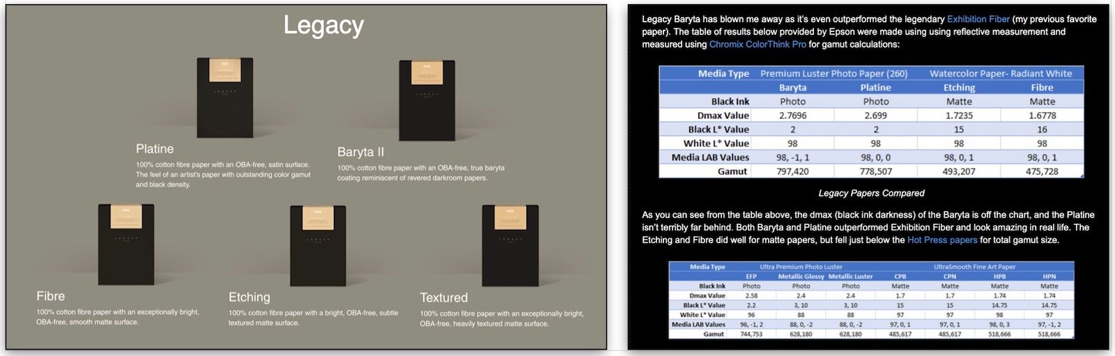
Choice of fiber type: cotton or purified wood pulp (alpha cellulose)
Almost all fine-art print substrates are made from conservation-grade cotton fibers or alpha cellulose, which is wood fiber treated to be as chemically inert as purified cotton. The papers I have used for limited editions since 2003 have been cotton-based: Somerset Velvet Rag initially, then Museo Max, originally from Crane then purchased and discontinued by Hahnemühle in 2021. Recently, I have had good results with Epson’s matte Legacy Fibre and low-gloss Legacy Platine. See this review for more.
For some test prints, maps, and panoramas, I use Epson Ultra Premium Presentation Paper Matte (UPPPM). It is a smooth alpha-cellulose paper with an excellent color gamut and high sharpness.
By focusing on a minimum number of papers, a printer may, over time, develop a high degree of finesse and control over every aspect of color and saturation as repetition makes accurate adjustments second nature.
Epson’s UPPPM paper is appropriate for tests and open editions partly due to low cost. At the time of writing, a box of fifty 8-1/2x11-inch sheets retails for $16 ($0.32/sheet). Compare that to the retail price of Legacy Fibre. A box of twenty-five 8-1/2x11-inch sheets retails on Epson’s website $55 ($2.20/sheet) seven times more expensive!
Coating technologies have matured and competition has bred innovation, such as can be seen in Epson’s recent Baryta papers which have a very high Dmax rating (a measure of the deepest black tone that a paper can reproduce).
Choice of paper thickness
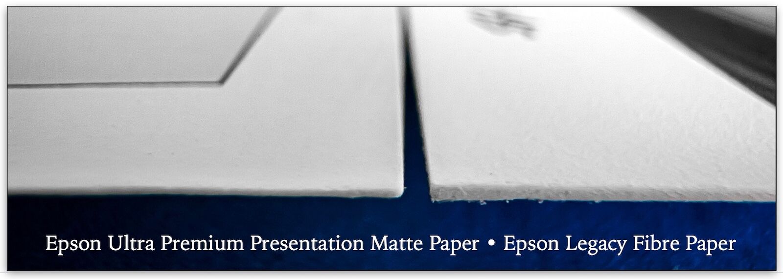
Epson’s UPPPM is (10.3 mil, 192 gms) & Epson’s Legacy Fibre (19 mil, 314 gms).
Choice of surface finish: Glossy, Luster, Matte, Watercolor, Canvas, and others
The matte Epson Legacy Fibre and low-gloss Legacy Platine papers feature a pleasing light texture, warm tone, and deep blacks. Luster or satin finishes are popular as they exhibit the high Dmax of glossy prints while reducing reflections. I use Epson Ultra Premium Luster paper when making test prints for final prints on Epson Platine.
The images below illustrate how a smooth-finished paper, Epson UPPPM (lower image), compares to the “semi-smooth” surface of Legacy Fibre (upper image). Strong side lighting emphasizes the difference. Legacy Fibre’s texture can evoke the look of traditional handmade art papers and minimize common problems with scanned film files such as soft edge detail or lens distortion.
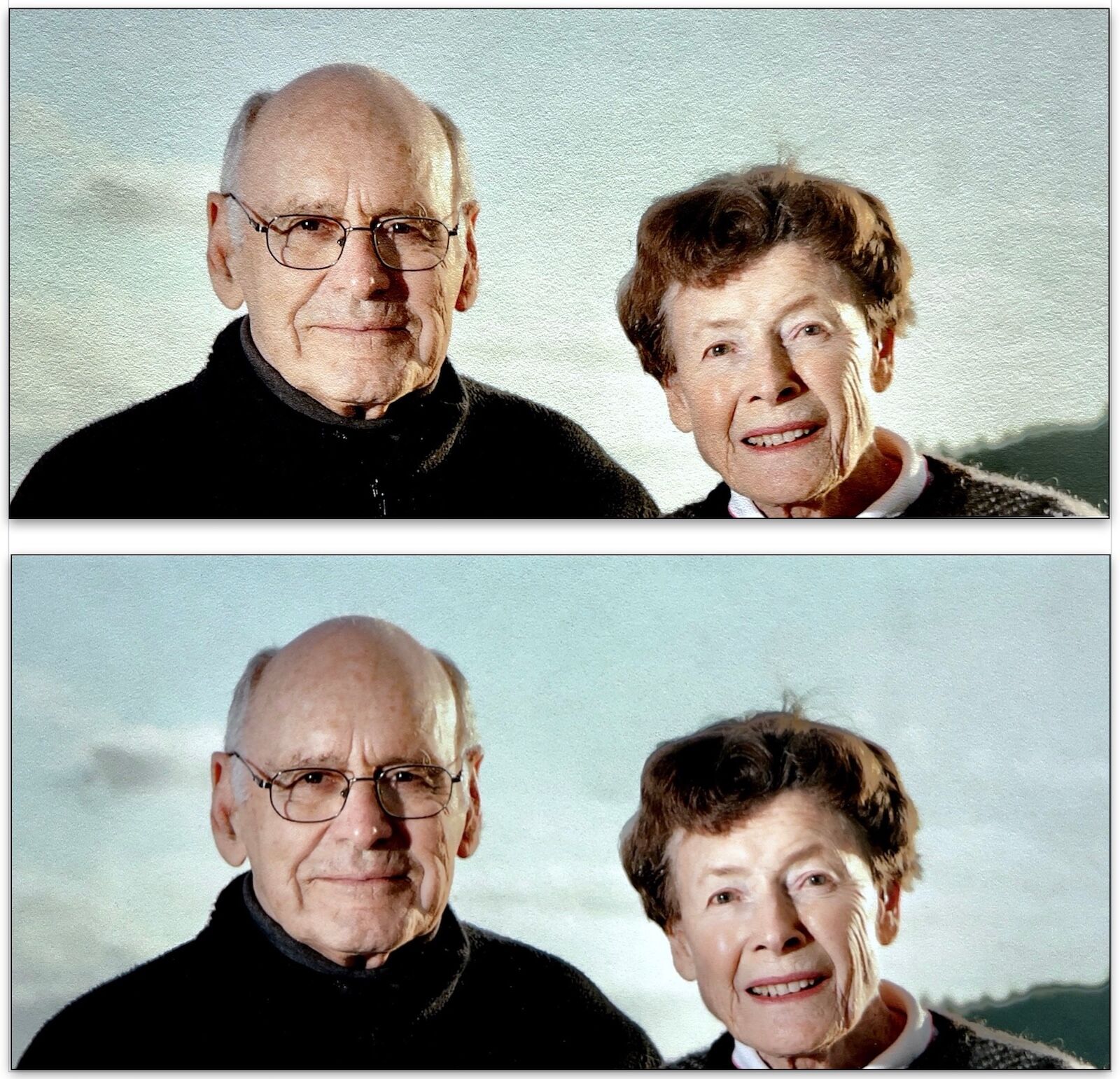
Surface texture comparison between smooth-finish Epson UPPPM (lower image) vs semi-smooth Legacy Fibre (upper image)
For my products made by outside suppliers (where affordability, not conservation, is paramount) I take a different approach to paper color and texture. Non-museum quality, open-edition artworks, such as my panoramas and historic maps, are pigment printed, then mounted onto wood or aluminum, and protected by a tough, optical-quality, UV coating. This compromise presentation, known as “plaque mounting,” has a decent, 115-year lightfastness rating, is thin, light, simple, and has no glass or frame, making it easier to ship. It is also much less expensive than museum framing. (I use Duraplaq in Denver, CO.)
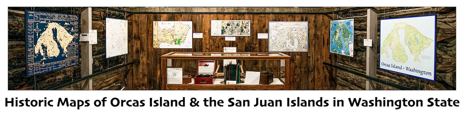
For these images, many of which have sky and/or water, I specify a cool-tone paper with a luster finish that will be protected by a satin laminate, which makes for an attractive combination without too much glare. I have not tried the latest “watercolor-style,” highly-textured papers, such as Epson Legacy Textured or Epson Exhibition Canvas Paper, a stretchable, cotton-poly blend available in matte, satin, and glossy.
Choice of paper color: warm or cool
Warm or cool paper color? Most print papers have a color bias that lies on the yellow-blue axis. The matte, fine-art papers that I like are mostly on the warm end of the spectrum, close to the original color of unbleached cotton. Epson Legacy Fibre 100%-cotton, fine-art paper has a brightness of 93% and no OBAs (Optical Brightening Agents). For landscape art, I prefer such “natural white” print papers matted in complimentary tones of cream or beige.
Epson Ultra Premium Presentation Paper Matte (UPPPM) is noticeably different. It is an alpha-cellulose-based paper (made from purified wood pulp), has a blue cast, and a 104% brightness rating due to OBAs. (Read more about OBAs below.)
There is no one right color for all images, only an appropriate choice of paper tone that enhances the subject matter. Photos with sky or water or metal may look best printed on paper with a cool tone.
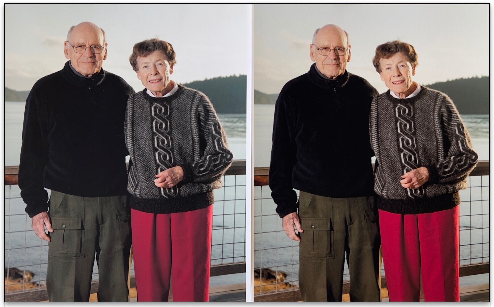
Color bias comparison between bluish-tone Epson UPPPM (left) vs yellow-biased Epson Legacy Fiber (right)
Images of sunsets, skin, or flowers may look better on a warm-white stock. Artist’s choice! Compare Epson UPPPM, on the left, with its bluish tonality and Epson Legacy Fiber, on the right, with its distinctly yellow bias.
OBAs and why I avoid them
Optical Brightening Agents are common in inkjet papers as they enhance the vibrancy of a print and lead to higher brightness levels, such as UPPPM’s 104% brightness versus Legacy Fiber’s OBA-free rating of 93%. OBAs are reputed to fade relatively quickly, so expensive, cotton, fine-art papers often avoid them. For my limited, museum-quality editions, I use only fine-art papers that are OBA-free.
Choice of Protective Spray
Just as painters sometimes apply a sealant over their artwork, I use a product called PremierArt™ Print Shield which, according to their website, is “a lacquer-based protective coating for all inkjet prints.” They also state that Epson recommends use of the product, and that Wilhelm Imaging Research shows that in a test with prints on Epson Somerset Velvet framed behind glass, Print Shield extended the life of the print from 62 to 166 years before noticeable fading. Bare-bulb display life went from 37 to 75 years.
.
Frame Design: work with a trusted framer to investigate the alternatives
One basic frame design creates a progression of tonal values from dark to light. A warm white seen in the print paper is purposefully lighter than the shade of cream of the surrounding window mat. The color of the frame is usually darker still, perhaps a bronze or dark walnut. (See image at the top of this article.) The value of this practical aesthetic is in how successfully draws the viewer’s eye inward towards the art.
.
Framing recommendations for Pigment Inkjet Prints
While aqueous-pigment, inkjet prints are perhaps the highest-quality print product available today, they do have some drawbacks. One being that the pigment inks sit on top of the paper—they don’t soak in like dyes do—and will scratch or scuff if touched. This necessitates matting and glazing, or plaque mounting with an optical laminate, in order to protect the fragile print.
Due to the high cost of conservation framing and the lack of awareness of many artists and customers of its importance, it is common to see improperly framed artwork. Framing things the right way might be more expensive, but it’s not necessarily more difficult. I buy materials in bulk and standardize my products to reduce complexity and cost. Here are some of the products that I use and recommend.
.
Considerations in the choice of mat boards and backing boards
I highly recommend the Artcare line of mat boards, matched with backing boards from Nielsen Bainbridge (now a division of Crescent Brands). For conservation purposes, Artcare adds a mineral “zeolite” to their products. They describe these products as a “Technology that safeguards your keepsakes. Just like antioxidants protect your skin from damaging substances, Artcare protects your keepsakes from harmful gases in the air. Natural minerals, called zeolites, trap and hold these gases, keeping them away from your cherished heirlooms forever.”
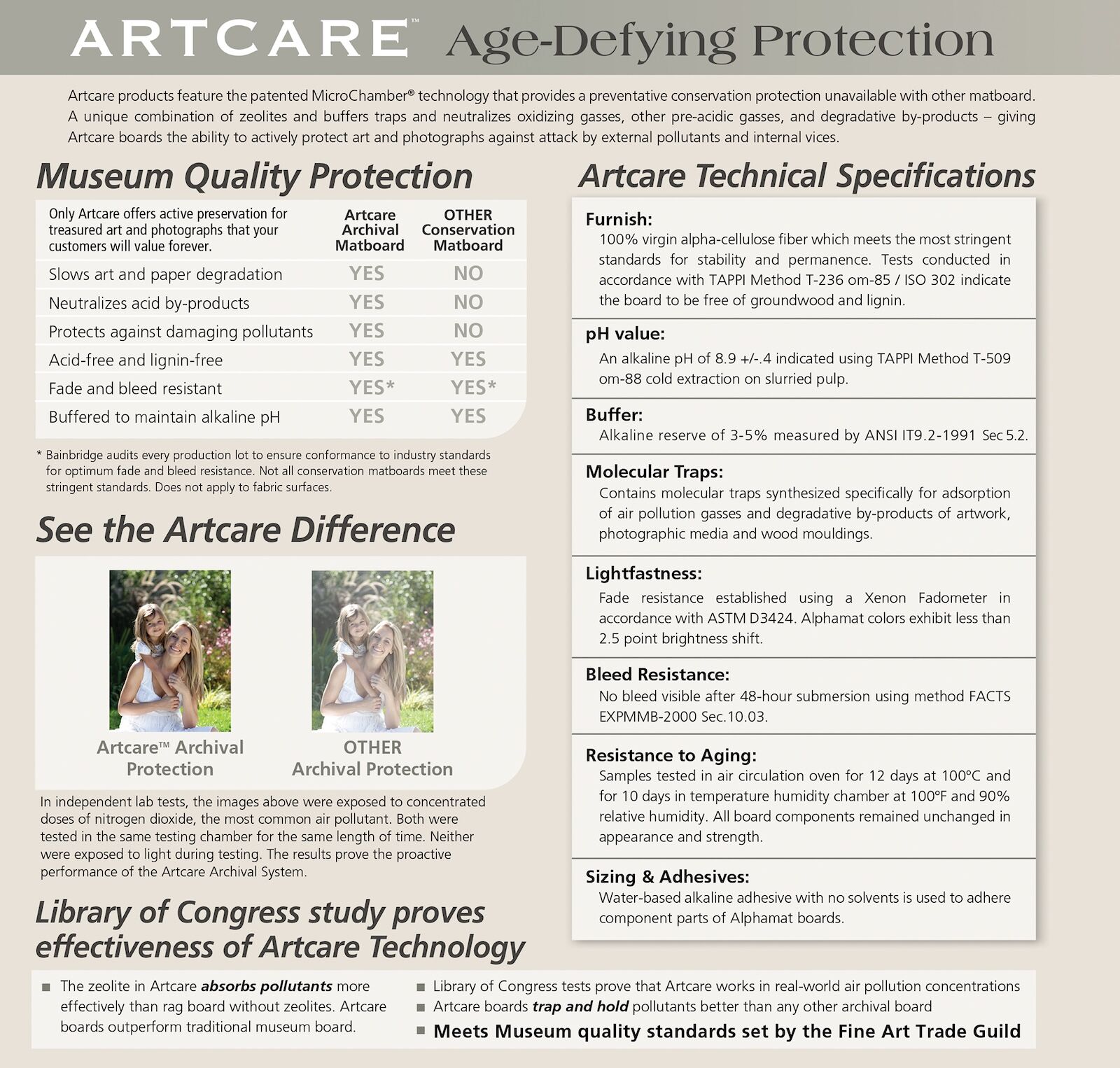
The features and specs of Artcare conservation mat boards
Zeolites have been added to mat and mounting boards because even though acid- and lignin-free, PH-buffered materials do no harm to the artwork they come in contact with, they do not prevent the migration of various pollutants through them. Zeolites, however, do.
In the late 1970s, I learned the hard way about the dangers of not spec’ing acid-free materials. I had shipped a framed Peter Milton etching of the Beauty and the Beast and the glass broke in transit. In the process of having the piece reframed, I discovered that the original framer had used an acidic face mat and a 1-ply cotton board as a token barrier between the mat and the print.
Materials create a microclimate inside the frame package that may protect or actually harm the art within. In this case, in just four years the acids in the mat board migrated and badly discolored the etching’s borders. It cost several hundred dollars to wash away the acids and stabilize the print’s PH, but the dark “burn” damage remained visible, permanently destroying the resale value of the art. You have been forewarned!
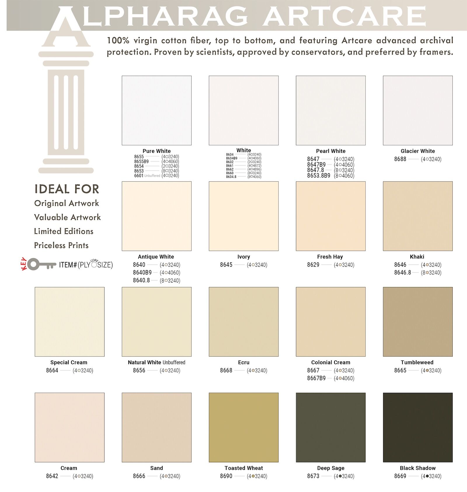
Artcare Alpharag mat board color options
I prefer two Artcare Alpharag mat boards: Natural White #8656, which I use as the face mat for most of my fine art prints. Its “natural white” color is compatible with warm-tone and slightly darker papers. For prints from my SK84EVER and Iridescence portfolios I use Black Shadow #8669 mat boards. For the mounting board, select Artcare conservation-quality foamboard. Prints on a glossy paper might look good with a Pure White #6601 mat.
.
Is artwork framed to museum standards archival?
You may have noticed that I stay away from the term “archival.” It is often seen in product names and advertising. Unfortunately, there is no scientific definition of what the word archival means in the real world, over time, with any given product. Use of the word by manufacturers implies that the materials in question, be they paper, glue, plastic, and so on, are intended to last as long as possible without damaging nearby materials.
The reason that a claim like “archival” should not be applied to artwork as a promise of longevity is that environmental conditions often play a greater role in an artwork’s longevity than materials do. Proper storage and display are crucial in mitigating against adverse environmental conditions. Out of curiosity, I ran my own real life test to determine how long one of my pigment inkjet prints would last if framed behind UV glass and displayed near a window where both heat and sunlight would damage it.
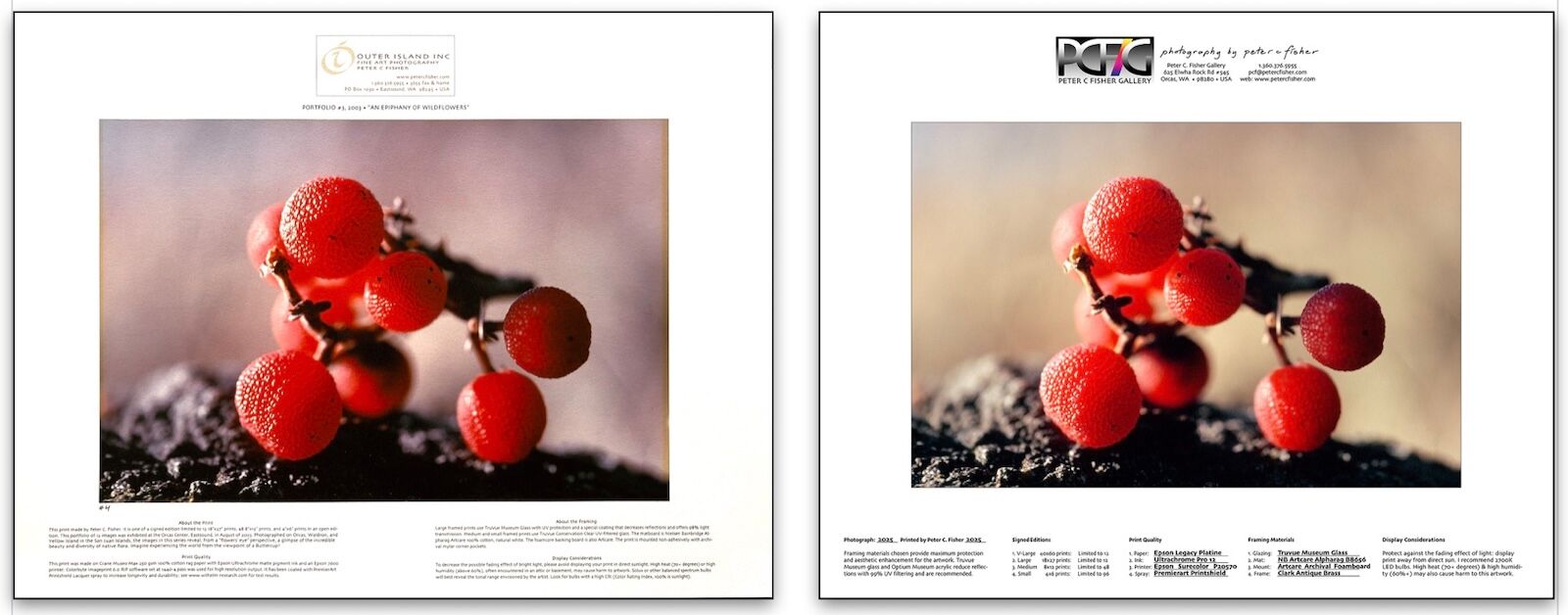
Color fading comparison: Epson 7600 Ultrachrome inkset printed in 2003 (left) vs Epson 9000 Ultrachrome HDX inkset printed 2015 (right)
The print above left was made with the Epson 7600 in 2003 with the first Ultrachrome pigment inkset (introduced in 2002 as a new, second iteration; 1995 was the first.) Yellow pigment tends to degrade fastest. This print had a relatively unstable yellow pigment and in just two years the fading was obvious. The print on the right was made with an Epson 9000 using the Ultrachrome HDX inkset from 2015.
If a similar “Madrona Berries” print, framed with UV glass, were hung with subdued illumination and consistently moderate temperature and humidity, it might last for a hundred or more years with little change. High heat and sunlight are quite destructive to pigment inkjet prints. Yet the life of pigment inks improve with each new technological iteration.
In 2024, Wilhelm Imaging Research published findings that “depending on the type of paper, the greatly improved light stability of the new yellow ink in the PRO12 inkset (2019) provides a 2X to 3X improvement in WIR Display Permanence Ratings compared with the earlier generation, Epson Ultrachrome K3 and HDR ink.”
On the generous borders of my fine art prints, and with the handouts I give to collectors of my artwork, I include suitable display considerations for the enjoyment and sensible protection of their investment in art. See the Image Permanence Institute’s guide to the care of digital prints for more comprehensive information.
I am very interested in the lightfastness test by Wilhelm Imaging Research comparing the fade resistance of Canson fine art papers printed with three different ink sets and displayed under a variety of conditions. For example, a print made on Canson Infinity Printmaking Rag paper with HP’s Vivera inkset is estimated to last 345 years before visible change when displayed under UV filtering glazing, but only 77 years under “bare bulb” illumination.
.
Non adhesive, fully reversible mounting techniques are my choice
A print mounted with a fully reversible, non-adhesive method
A steadfast rule in conservation framing is to never fully adhere a print to anything. Reversibility is a basic requirement of this methodology. The industry standard is to use Japanese paper hinges to connect a print to the mount board with a minimum of glue that can usually be gently removed with very little impact. If there is an insufficient border around the image area on which to adhere the paper hinges, risk is involved when trying to reverse the mount. Water is usually used as the solvent when removing these paper hinges, a process which can leave permanent wrinkles or discolor the print paper.
Print paper and mount boards also expand and contract at different rates. By steering clear of dry mounting (bonding prints with an adhesive sheet) or face mounting (adhering a print to the backside of acrylic glazing—a popular non-museum presentation method) each material can expand or contract as needed without stressing the other. If damage does occur to either the print, or the mounting material, they are individually replaceable.
I do not sell bare prints in my fine-art line. As mentioned earlier, pigment ink sits on top of the paper and is susceptible to damage from contact or abrasion. By selling prints in a mounted-and-matted, ready-to-frame package, I accomplish three goals.
• I provide the customer and framer with a product meeting museum standards in terms of construction and materials.
• I prevent a customer from unwittingly acquiring the acidic mats and backing boards that are so often found in discount frame shops.
• The art is bagged in safe, plastic envelopes so damage to the print from inadvertent touching is prevented.
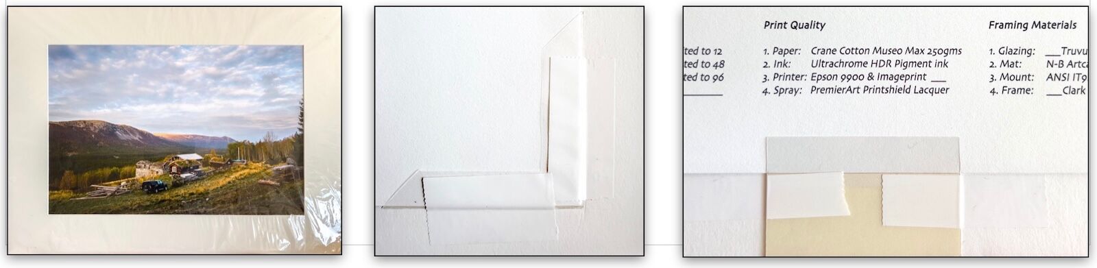
Illustrated above left is a matted-and-bagged print ready to frame. The image above center shows a close-up of a corner pocket with reinforcing tape (Framers Tape II). The image above right shows one of the mounting strips, also reinforced with tape, that are found midway, on all four sides of the print.
For large prints (an 18x27-inch image on 24x32-inch paper, mounted in a 26x35-inch frame) I use four corner pockets and four mounting strips that mechanically trap the print paper, while leaving about 1/16-inch of slack on all corners and sides to allow the print to expand and contract. Allowing the print room to move reduces buckling and facilitates easy removal and replacement.
.
A simple mounting procedure eliminates measuring and marking
A few inexpensive tools expedite the process of centering the print on the foam backing board before mounting. I use self-healing cutting mats, printed with 1-inch grids, as a work surface. The image below left shows how I place a 16x20-inch foam board on the grid. For an 8x12-inch image on 12x15-inch paper, the bottom of the print will be 2 inches from the bottom and 2-1/2 inches from each side.
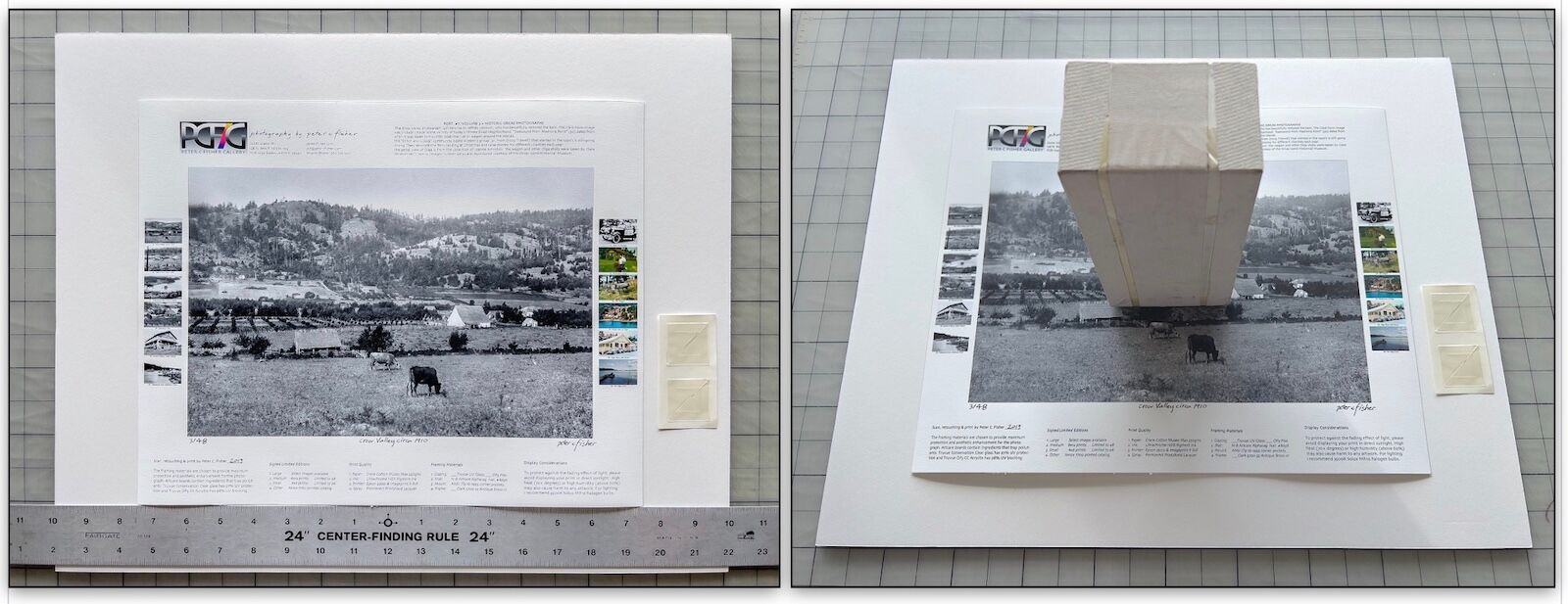
Centering the print on the backing board
Place a centering ruler’s top edge 2 inches up from the foam board’s bottom edge as indicated by the grid lines on the cutting mat. Make sure the ruler is centered side to side. The 10-inch markers should line up with the sides of the foam board.
The print is then positioned flush with the ruler’s top edge and 2-1/2 inches from either side of the foam board. With the print properly located, a paper-wrapped brick, with a replaceable foam-board pad on one end, is placed carefully on the print to hold it in place. This is just enough weight to hold the paper for final positioning. (See image above right.)
Not shown is a final check of how well the mat will cover the image. With the brick in place, I lower a mat over the print, moving it up and down, and side to side, to judge the accuracy of the centering, while avoiding contact with print.
When the print, mat, and foam board are properly aligned, the mat will cover 1/4-inch of the image on all four sides, if the window is 1/2-inch smaller than the image. I cut my mat windows 1/4-inch smaller (7-3/4x11-3/4-inch for 8x12-inch prints), so the overlap is 1/8-inch.This makes centering the image more difficult but hides less of the photograph.
The weight of the brick allows the framer to gently slide the print up, down, or sideways as needed. The brick stays in place while the corner pockets are installed. The final step is to reinforce the corners with Framers Tape II for extra security.
The clear bags I use are perfectly sized to hold the mat, mounted artwork, and backing board in place. The whole package is protected and ready for framing.
.
Factors in choosing a Metal Frame or a Wood Frame
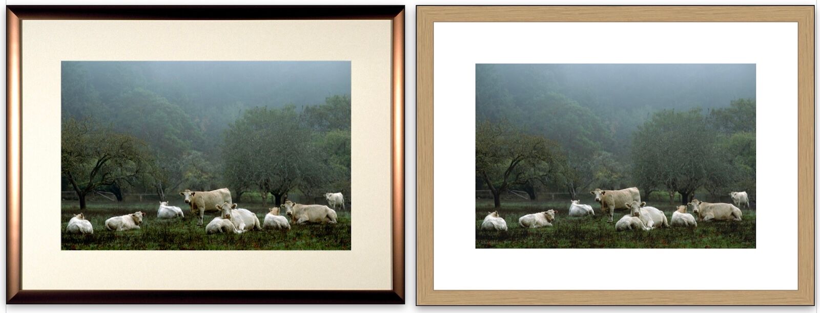
Frame comparison: metal frame (left), wood frame (right)
Advantages of aluminum frames
As a conservation framer, I appreciate that neither a metal frame nor its finishes, usually anodizing or paint, will harm the art materials within.
A classic black, silver, or gold frame will work well for most art and home decor. Metal frames are easy to build. Frame sections assemble without special tools or skills, and offer a clean and modern presentation. Until they were discontinued, I used (very expensive) brass-anodized frames that were relatively wide, and curved gently into the wall, making a beautiful and distinctive presentation.
Disadvantages of aluminum frames
As aluminum frames get wider and thicker, they get more expensive. Anodized aluminum has a very hard, cleanable finish, but it scratches. And, due to the way aluminum is formed, there aren’t nearly as many styles, shapes, colors, and surface treatment choices as there are for wood frames.
Safe method for final step in installing artwork in metal frames
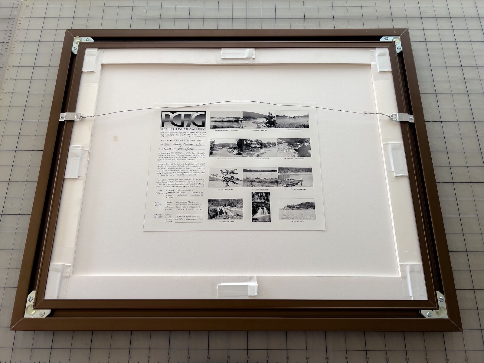
Artwork safely installed in a metal frame using foam-board strips and mat wedges
.
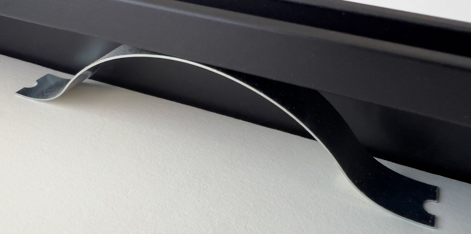
The larger image above shows the back of one of my 16x20-inch frames. The smaller image at the bottom shows a conventional metal spring clip of the type that are frequently used to hold the artwork in place within a metal frame. The clips are great for temporary use, but I sometimes find them hard to install and remove. I also find that they often exert too much, or too little, pressure on the artwork.
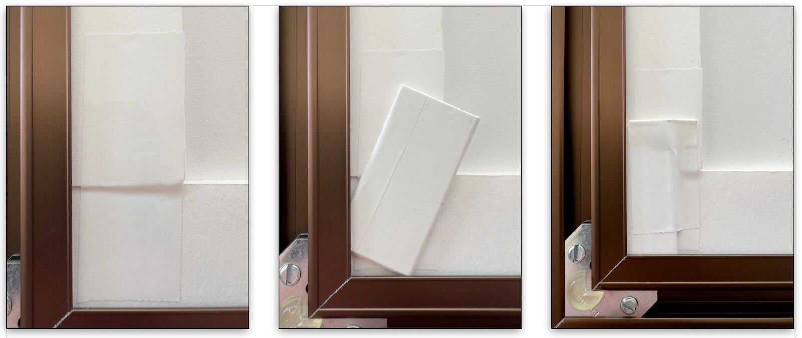
Installation of the mat wedges
I replace the spring clips with a combination of foam-board strips (the same material as the mounting board) and mat wedges (the same material as the face mat). The wedges apply gentle pressure on the foam-board strips and are quick to install. I then apply Framers Tape II over each wedge to hold it firmly in place, making sure to leave a tab of folded tape at one end to facilitate clean removal and reapplication.
Advantages of Wood Frames
Wood frames are traditional and available in an incredibly wide variety of colors, styles, dimensions, and costs. An experienced framer will offer you a range of options to consider for what might look best with your artwork. I find that wood often has a warmth and personality that metal cannot equal.
Disadvantages of Wood frames
Frames are meant to both enhance the appearance of your artwork and protect it from damage. Yet wood is a product of nature and, as such, it contains acids, lignin, and other impurities. Some paints and stains applied to wood contain volatile ingredients that can damage nearby artwork as they degrade over time.
To create a benign environment inside the frame package, and to prevent the wood and/or the finish from damaging the contents, I place a barrier on the inside of the rabbet using Lineco brand, foil-backed Frame Sealing Tape. (See photo below.)
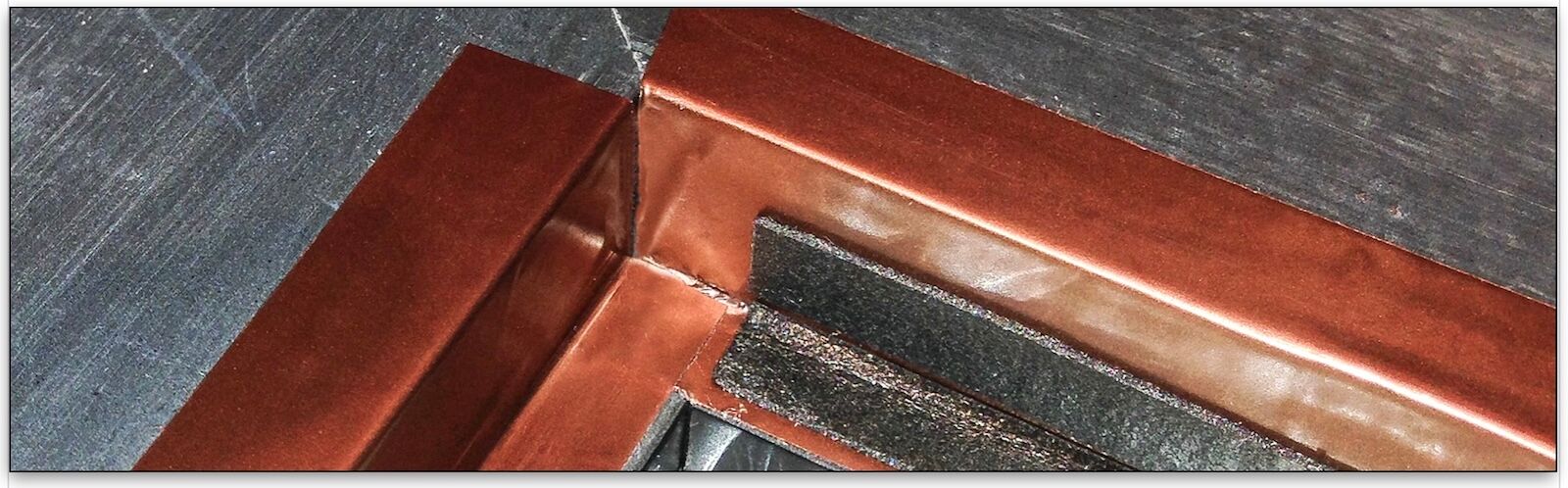
Sealing the print with foil-backed tape to isolate it from the chemicals in wooden frame
In the photo above, the additional black, foam, rabbet tape placed on top of the Lineco bronze-colored sealing tape will provide shock resistance for the 40x60-inch museum glass and reduce breakage while the framed piece is in transit.
Wood-frame finishes may be delicate. Since wood is not as hard as metal it can be easy to dent or chip a wood frame during handling.
.
Quick-change, magnetic frame design for 40x60-inch prints
For my 40th-anniversary exhibition in 2015, I developed a unique system for mounting and framing very large pigment prints, in this case 40x60-inch images printed on 44x62-inch paper. I call this a “Holy Grail” frame design because it serves multiple purposes: it meets museum criteria for mounting the print with a non-adhesive, “hanging” approach, while the magnetic closure on the piano-hinged back frame enables the artist to access, and quickly change, the frame’s contents without the use of tools.
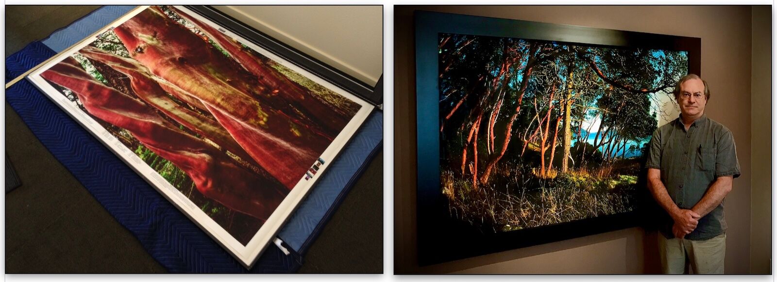
My quick-change framing system
This system is not intended to replace conventional mounting methods, such as hinges with Japanese paper. That highly-versatile industry standard can be adapted to mount almost any work of art on any type of paper. The correct method for mounting art by hinging requires considerable expertise, due to variations in print papers, mounting materials, glues, and in choosing the appropriate kozo hinges for the job.
The main practical aspect of this new, quick-change framing design is the “print package” (the combined backboard, printed artwork, and attendant mounting hardware) which provides maximum protection for the artwork under both display and storage conditions.
As I mentioned previously, when a print is 40x60 inches in size, it becomes difficult to handle. The thick, cotton papers I print on are brittle, easy to dent, and prone to creasing damage if folded instead of being draped loosely from opposite corners. The aim is to never handle the print itself, and this is aim achieved when the artwork is held safely within the print package.
The “quick-change” functionality, another benefit of this framing design, works thusly: the artist, with an assistant, may take the frame off the wall—these extra large frames require two people to handle them—set it on an appropriate surface, open it without tools due to the hinged, magnetic closure, remove one print package, replace it with another, close the frame and rehang the piece, all within about five minutes. If a speck of dust were to fall into the frame during the process, getting it out would not a problem.
The way the artwork is hung within the print package, instead of being dry mounted or hinged, confers additional benefits. For one, the print paper is free to expand and contact with changes in the environment. Thus damage due to constraints on the ability of the artwork to move are avoided. This freedom of movement is not possible when artwork is hinge mounted as that process creates two or more anchor points of more rigid connection.
Another benefit addresses the hazard of wrinkling when big inkjet prints are not adhesively mounted to keep them flat. My large prints have at least a 1-inch border around the entire image. When the print is hung within the print package, it is gently sandwiched between the backing board and strips of mat board which are attached to the back of the wood frame. When the frame is closed, the strips apply just enough pressure to the print’s border to flatten the the piece, while still permitting it to move with environmental conditions, in the same way a window mat would.
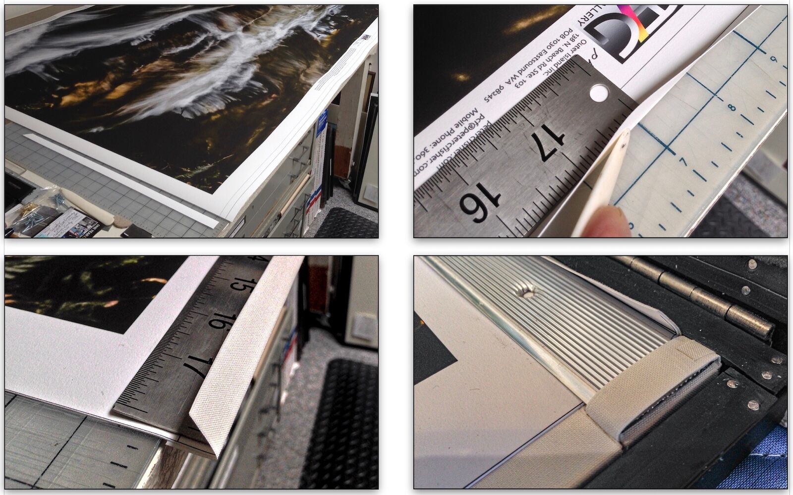
Creating the quick-change print package, a fully reversible, non-adhesive mounting for large prints
This is how the print package is made:
• I print the piece with a 1-inch border along the sides and bottom of the image, and a 2-inch border at the top. I also add two guidelines to the top of the piece, at 1/2-inch and 1-inch, respectively, from the top edge.
• A tray is positioned under the output area of the printer to catch and securely hold the print as it emerges and is cut off of the roll. The print is then slid onto a table (upper left image, above).
• The top edge is then scored and folded at the 1/2-inch guideline with the aid of a ruler and a bookbinding tool, called a bone folder (upper right image, above).
• The top 1/2-inch edge is then folded all the way over and reinforced with cotton tape to form a flap that allows the print to hang—no glue. (lower left image, above).
• A backing board of 3/16-inch, Artcare foam board is slid under the print. Then an aluminum bar is placed over the top edge of the print, such that it rests in the crook of the flap, and is mechanically attached to the backing board with a cotton strip (bottom right image, above.) When the hinged frame is closed, the flap, and thus the entire print package, is firmly held. Unframed, the print package is secure and may be stored vertically, then moved easily back into a frame for exhibition.
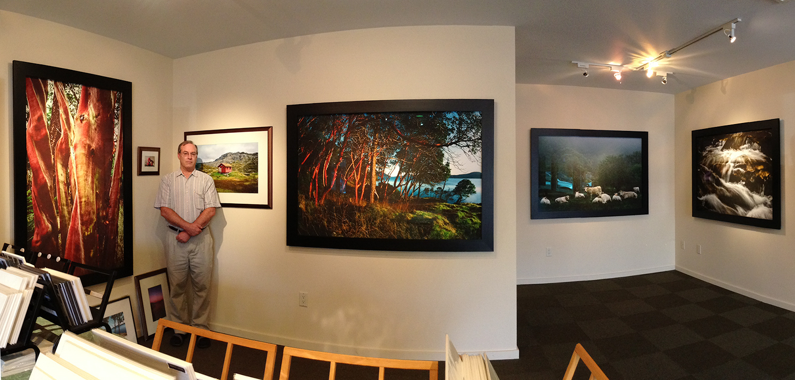
My prints on display in my former gallery in Eastsound
An uncanny consequence of this combination of a very large print, under museum glass, deeply recessed within a wide, black frame, and spot lit with gallery lighting, is that, in some images, a powerful illusion of three dimensionality is produced. Puzzled visitors try to peek around the back to see what is going on! This attractive presentation draws the viewer into the visual poetry of the artist’s vision, as if it were just on the other side of a window…
.
Glazing options to consider
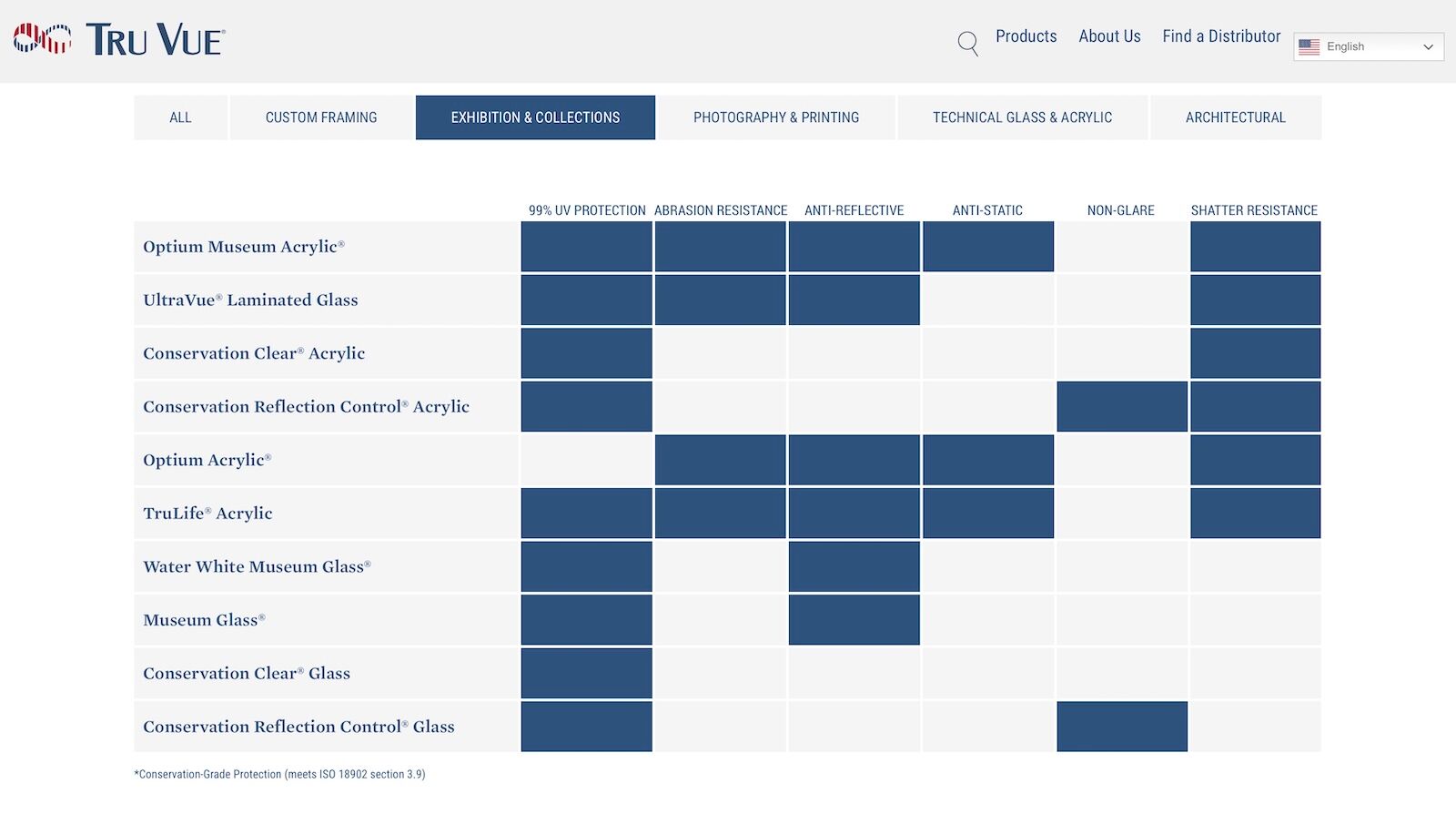
Features of various Tru Vue glazing options
For small and medium-size framed prints, I offer Tru Vue Conservation Clear Glass as the default glazing and Tru Vue Museum Glass as an option. For my large and very-large-size prints, Tru Vue Water White Museum Glass is the standard choice. While substantially more money, it is the least offensive choice, given that glazing is required for museum-grade protection of framed, pigment, inkjet prints.
Water White Museum Glass is visibly superior to Conservation Clear Glass. It has a special coating that almost completely eliminates reflections, so artwork remains more visible even when displayed opposite windows. It features the best-available UV-light protection. Tru Vue claims it “blocks up to 99% of UV rays.” It also has a light-transmission spec of over 98%, meaning that, while it blocks almost all UV light, it transmits over 98% of visible light. This means you see the art noticeably better than through Conservation Clear glass, which has an 89% light transmission rating.
Another standout feature of the premium, Water White glass is that the “substrate provides crystal-clear color transmission.” When looking at the edge of this glass, you’ll notice that it is neutral in color. You won’t see the green tint, caused by the small amounts of iron oxide impurities (Fe2+ and Fe3+), normally found in conventional soda-lime glass. This lack of tint permits the true colors to shine brightly forth, unimpeded by discoloration. Under ideal conditions, in a properly-lit environment, the net effect of Museum Glass’s technical superiority is that it seems to disappear, and thus not interfere with the art’s impact on the observer.
There’s one more Tru Vue product I’d like to mention. That is Optium Museum Acrylic, which offers 99% UV protection, and the same kind of anti-reflective coating as Museum Glass. It is 30% lighter than glass and very shatter resistant. It also features anti-static protection and anti-abrasion resistance, properties which are unusual for an acrylic. These days, online retail prices for Optium Museum Acrylic are sometimes competitive with Museum Glass, so I recommend comparison shopping.
.
Hanging options
I use two different hanging options. The first is traditional, and utilizes a wire and two hooks of the kind shown in lower right image, below. (Very small frames only require one hook.) The wire hangers are placed as close to the top of the frame as possible to reduce the tendency of the top of the frame to sag away from the wall. I place the wire 3 inches from the top on 16x20-inch frames and 5 inches from the top of 26x35-inch frames.
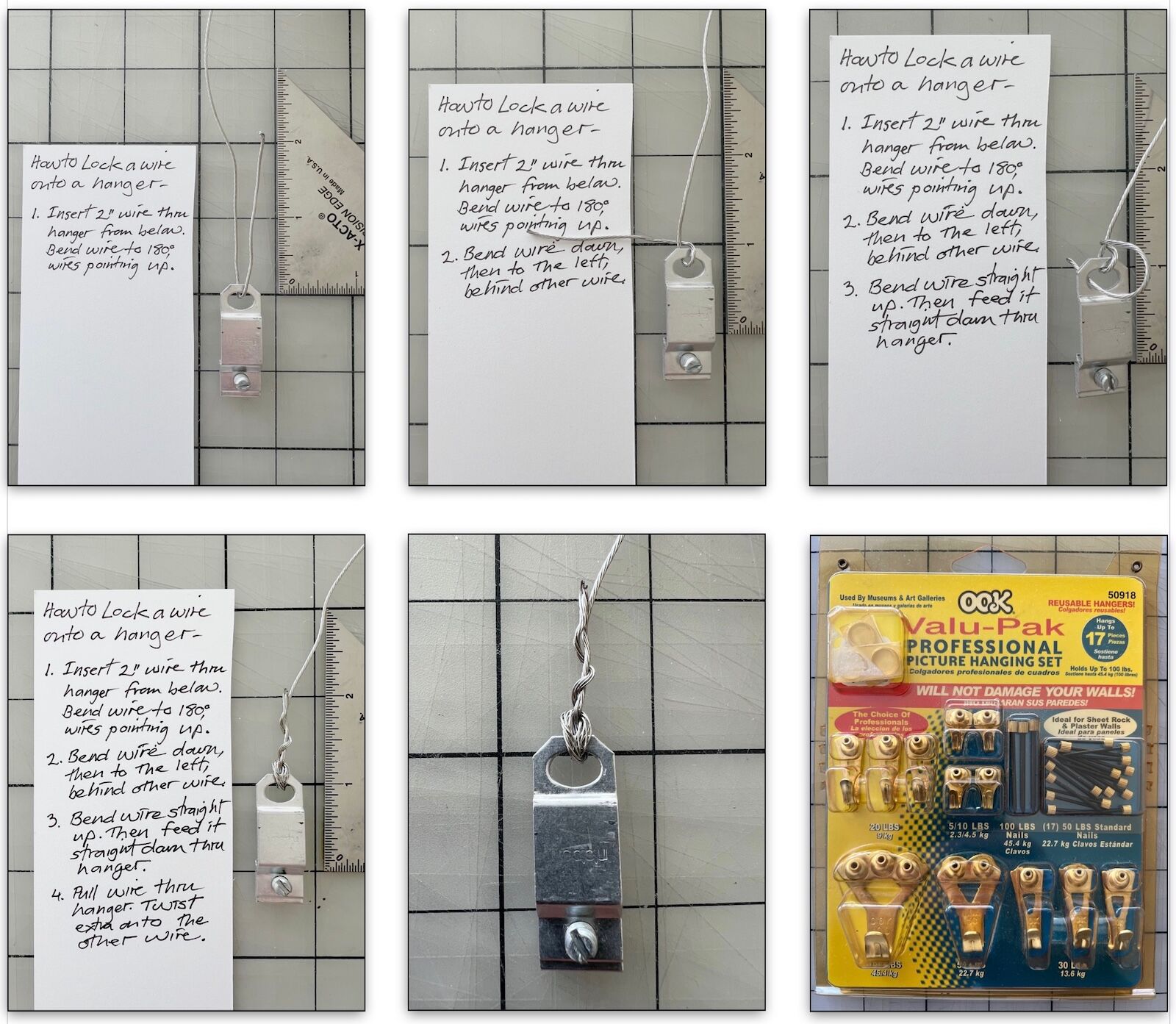
How to lock a wire on a frame hanger
Recently, I have switched to a second option, a clever hanging system featuring frame-mounted, corner brackets that compensate for non-level wall hooks. The system offers a very secure mount in which frames hang perfectly flush to the wall. The hangers are called WallBuddies. Here is information from their website:
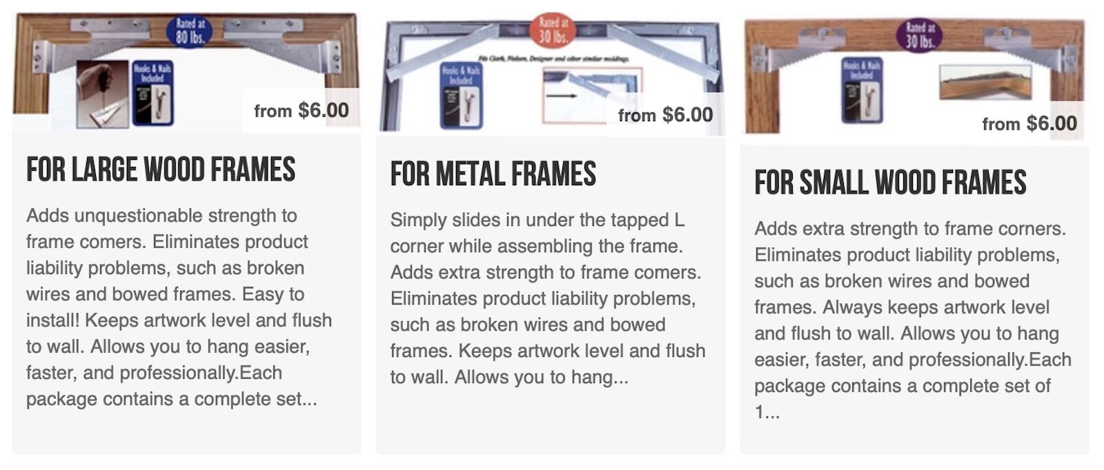
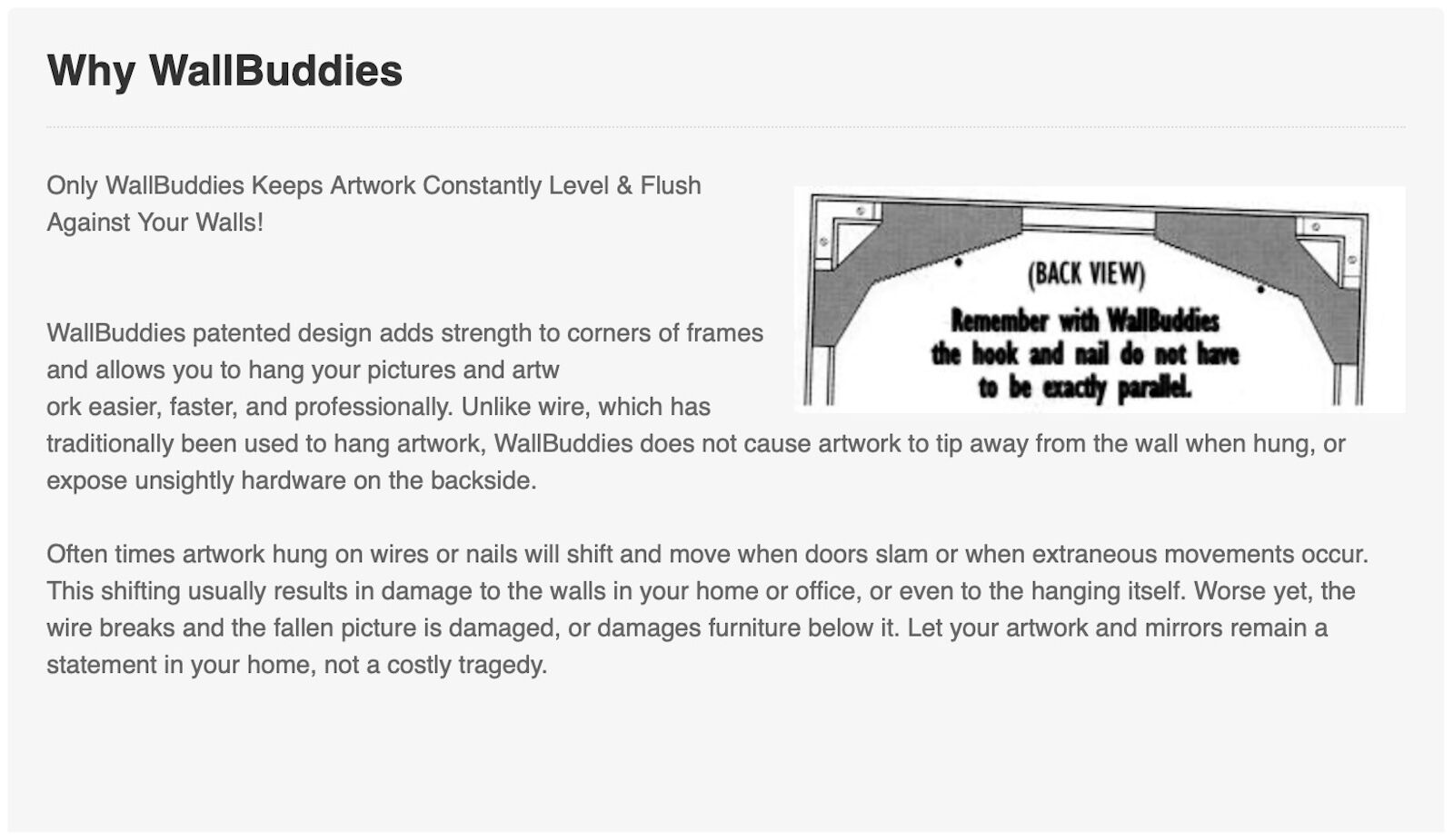
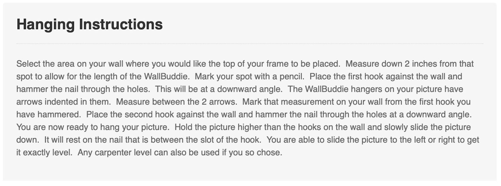
.
Lighting Options
Artwork benefits when lit by a bulb with specifications chosen to complement the print paper and subject matter. I have been using the three brands shown below: Soraa, Cree, and Green Creative. All are 2700K in color temperature (warm white); all offer a variety of beam widths from a 9-degree spot up to a 40-degree flood; and all have a CRI rating (Color Rendering Index) between 90 and 95 out of 100 (a higher value means the light renders colors more accurately).
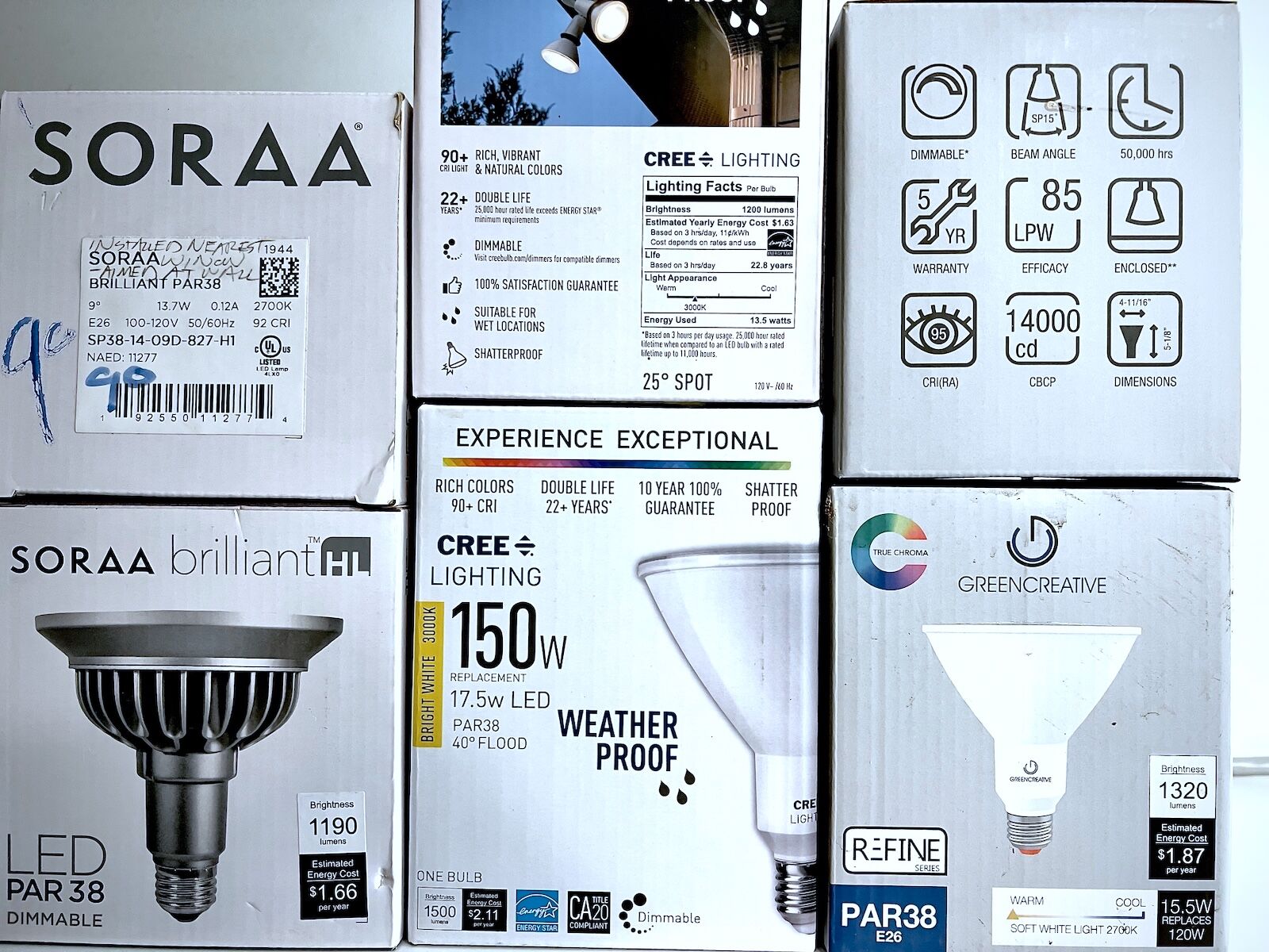
Bulbs I prefer from Soraa, Cree, and Green Creative
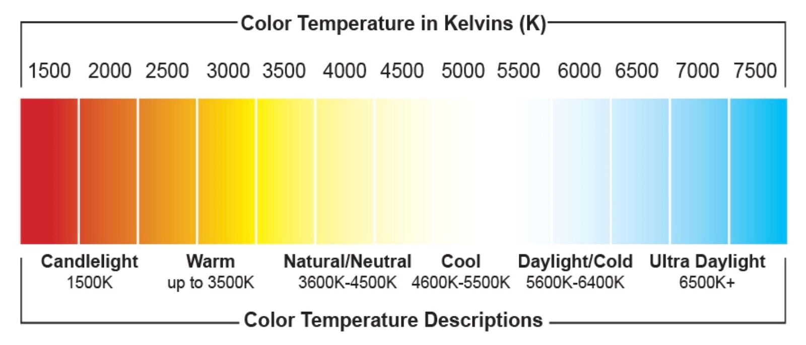
I like LED bulbs with a color temperature of 2700K because they are ideally suited to enhance the colors of print paper, mat, and frame that I most often pair with my fine-art prints. My home’s living spaces are mostly beige and brown, and the floors are wood, all compatible with 2700K illumination. Museums often specify 3000K—a good compromise for a more balanced “look” for both warm and cool colors.
As a contrast, I did a printing, framing, and lighting job for a client with a new house designed and built with modern, unadorned lines, and black, steel construction. The interior walls were painted in a “blue-white” hue. To compliment the interior, we chose 4700K bulbs and print papers, mats, and frames to match—all on the cool side. The end result was crisp and clean.
One can also aim for a neutral look. In the Alpharag Matboard line there is a color called “Pure White.” I have not researched which print papers are closest to neutral in tone. If you have, please let me know what you have found. I recommend making test prints with different media, and different renditions, to figure out what is your favored tonality for a given kind of image. Below are examples (from left to right) of warm, neutral and cool:
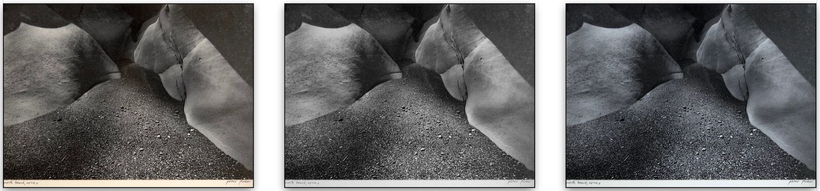
The effects of warm, neutral, and cool lighting on the same print
In the gallery, I used to do a lighthearted, non-scientific demonstration showing the impact of warm versus cool bulbs on the display of artworks. I made two identical black-and-white prints of the Buddha and Child photograph from my Black & White portfolio. I would then hold both prints up at the same time, a few feet apart, one under 2700K light, and the other under 4700K light.
I would innocently inquire which version of the print they preferred. Interestingly, the audience usually split about 50-50 in their preference for either the warm or cool versions. Then, to their dismay, I would simultaneously switch the prints to the other bulb. Most people found it confounding that the bulb’s color, not the print’s, really controlled the final appearance.
They had never considered the influence of lighting color on an object. When creating and displaying art though, I think it’s smart to control it. I recommend starting with a print’s tonality, then selecting a mat, frame, and lighting that are compatible. View your test prints under display lighting.
.
Frame Back Information
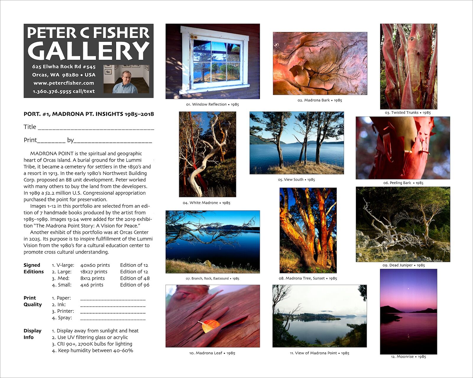
My frame back label which acts as a Certificate of Authenticity
The final step in creating a complete museum-quality presentation for pigment, inkjet prints is to supply information on the back of the frame that mirrors what is found on the print template I mentioned earlier. Thumbnails of the portfolio, the story about the piece, a business card, and product details are all included. I supply a second copy of this document with the invoice after purchase. This “frame back information” approach is my version of a “Certificate of Authenticity.”
For information about the standard format for a “Certificate of Authenticity,” see this article.
This article is by no means a comprehensive survey of all the factors and choices involved in framing pigment, inkjet prints using conservation techniques. Instead, it is an overview of one artist’s attempt to create the safest possible framing environment for the artwork to live in, and one that honors the inherent beauty of the print. Enjoy!
.
Links to Information in this article:
1: Wilhelm Imaging Research
http://wilhelm-research.com/index.html
2: Johope Technology, “Piezoelectric Inkjet Printing Technology: All You Need to Know”
https://johopetech.com/print-basics/piezoelectric-inkjet-printing-technology/
3: Epson Legacy Papers review
https://www.ronmartblog.com/2016/02/epson-legacy-papers-reviews-tutorials.html
4: Image Permanence Institute’s guide to the care of digital prints
https://s3.cad.rit.edu/ipi-assets/publications/dp3_guide.pdf
5. How To Create A Certificate of Authenticity
https://www.contemporaryartissue.com/how-to-create-a-certificate-of-authenticity/