
The Art of Printing
Great Prints by Great Artists Have a Unique Look and Feel.
Not always, but frequently, fine art photographers have made their own prints. Others have expert printers that they work with. Every experienced printer with artistic ability develops a personal style that becomes a kind of visual signature.
A stellar print by a great artist contains a multitude of attributes: a unique use of tonality, contrast, shadow-and-highlight detail, color saturation, and balance, and so on, that together define an artwork’s look and feel. An artist’s visual vocabulary is a design language that permeates and informs their work with an indelible style and feel that sings, print by Ansel Adams, or Jerry Uelsmann, or Elliot Porter, or Edward Weston.
Music works in a similar way. One of my favorite examples is the Rhino Records compilation LP of 10 wildly different versions of Washington State’s official song, Louie Louie. Here is a link to the album on Youtube:
The Best of Louie, Louie, Rhino Records, Side 1: The Rice University Marching Band, Richard Berry, Rockin’ Robin Roberts, The Sonics, and The Sandpipers; Side 2: The Kingsmen, The Last, Black Flag, Les Dantz And His Orchestra, and The Impossibles.
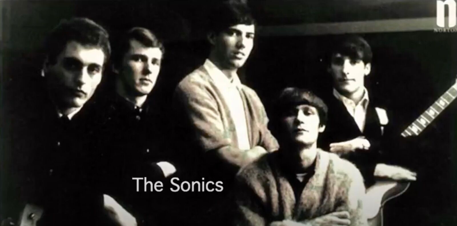
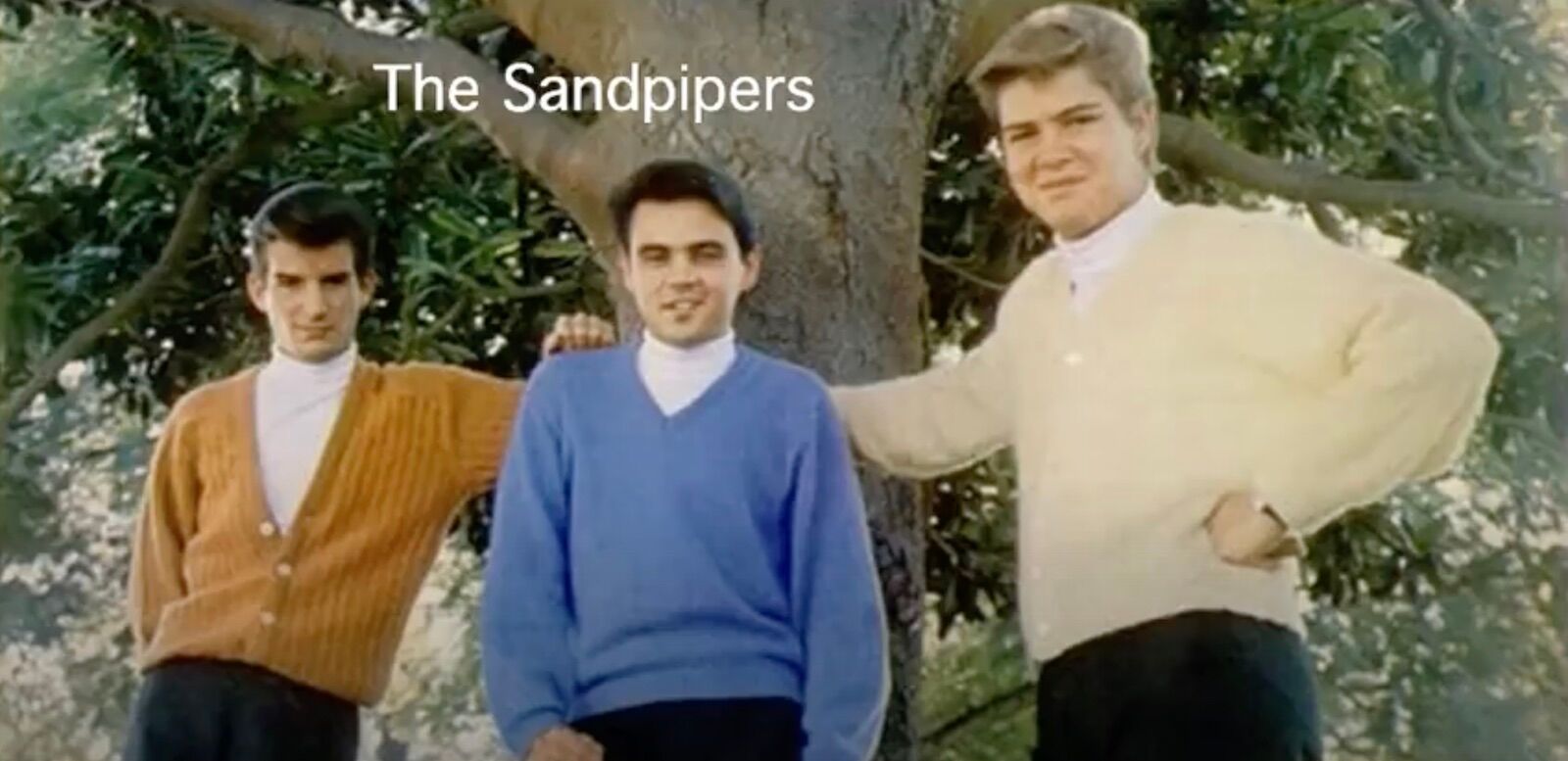
The contrast between musical styles in this compilation demonstrates how, despite identical origins (i.e., the score), performances may be impressively diverse. A listen to my favorite—The Sonics’ early-1960s garage rock version—is guaranteed to get you on your feet, screaming along. Following that with The Sandpipers easy-listening take, will ease you peacefully into the nap you’ll need after slam dancing to The Sonics.
.
Featured Black & White Photographer: Edward Weston
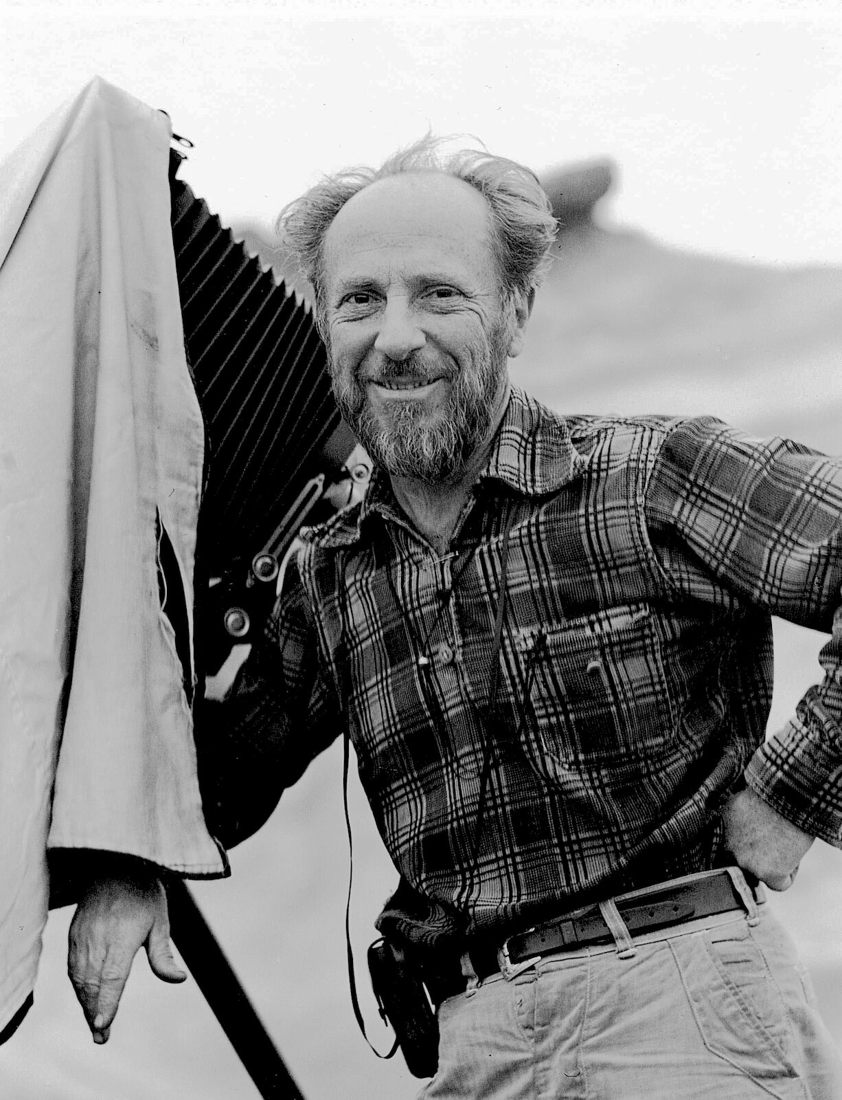
My personal favorite black-and-white photographer/printer is Edward Weston. Viewing his original prints has been the highlight of my life-long exploration of the art, and practice, of superlative printmaking. His choice of materials and his technical virtuosity were a perfect match for the ingenuity and simplicity of his aesthetic approach to the medium. Visit this website to read a brief biography and view his portfolio: https://www.edward-weston.com/edwardweston
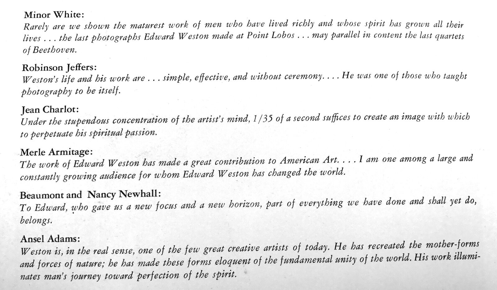
Weston imbued his luminous prints with a depth of feeling that ushers a receptive audience into the presence of the numinous energy that sustains life. What is utterly remarkable, is the universal and dramatic impact Weston’s transcendent printmaking skills have had on other artists. I’ve included tributes to his genius, from a variety of artists, originally printed on the last page of the Weston book pictured below.
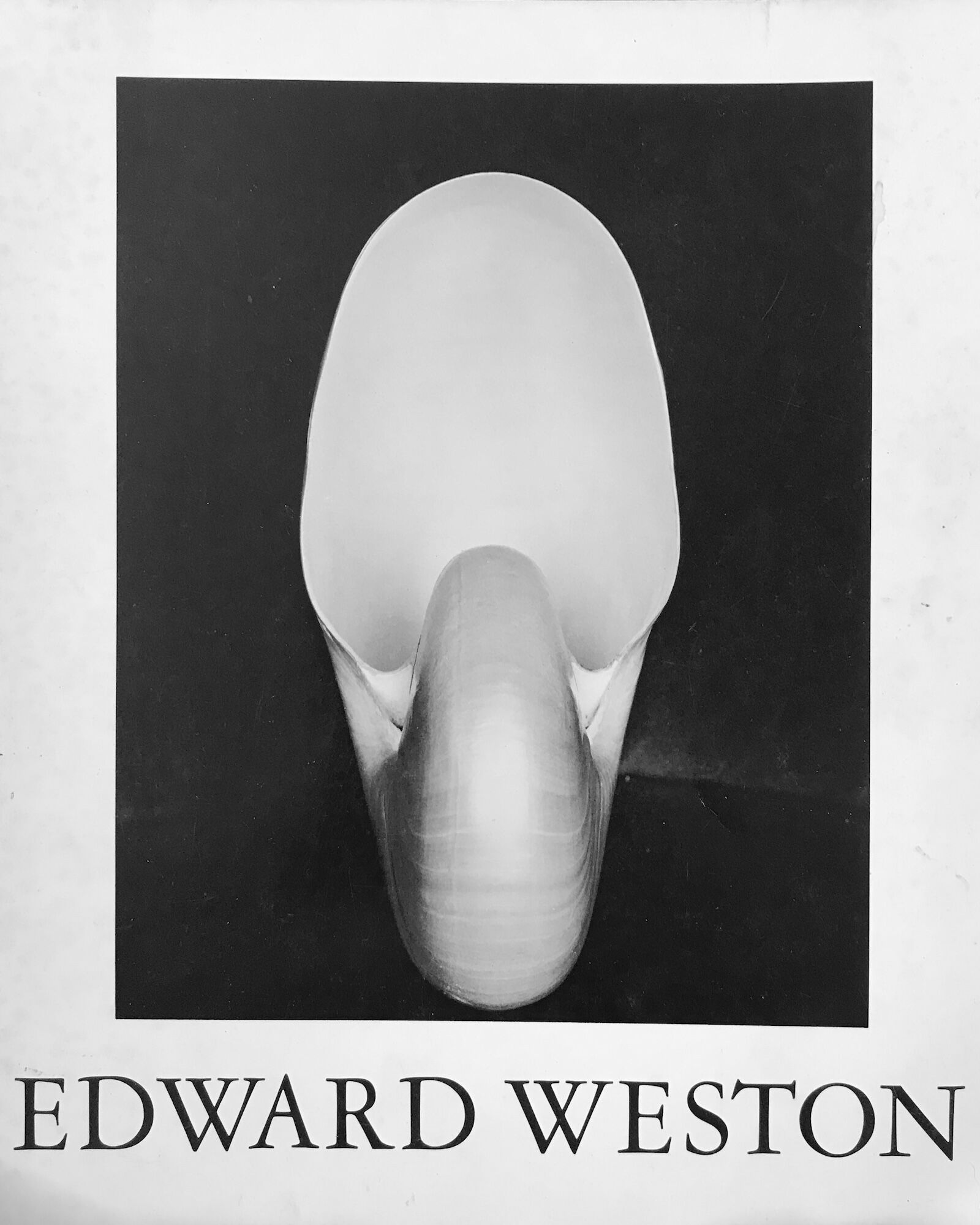
Edward Weston, The Flame of Recognition, book, 1965
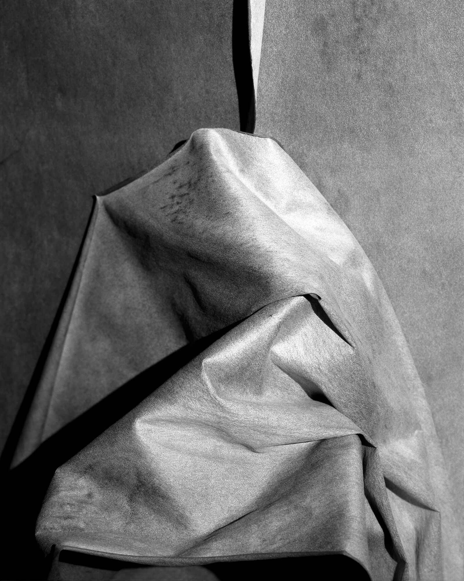
Madrona Bark, Peter Fisher, 1985
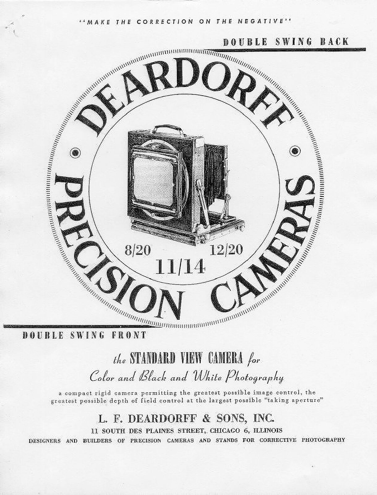
Weston’s penetrating vision was a massive influence on my early work from the 1970s and 1980s, which was created mostly from black-and-white, large-format negatives exposed in a Deardorff view camera—the same basic type as Weston’s. The image to the right of the Weston book cover is my silver gelatin print, Madrona Bark, shot on 4x5-inch Polaroid Type 55 P/N film, on Madrona Point, circa 1985.
The Madrona Bark image resulted from my search for a composition in nature that appealed to me, emotionally and aesthetically, in a way similar to what I experience when enjoying a favorite Weston image.
About thirty years later, two gentlemen came into my Eastsound gallery. They caught my attention because they looked at, and discussed, every print on display. It’s pretty rare to see that level of engagement. Most folks just breezed through, spending little time on any given photograph, as my prime location brought in a lot of casual visitors simply out exploring the village.
One of the pair paused in front of a large, framed print of Madrona Bark and intently studied it. My curiosity got the better of me and I inquired—usually not a good idea as it puts people on the spot—What is it that you find interesting about this photograph? The bombshell response, unanticipated and mind-blowing to yours truly: Was this composition inspired by Edward Weston?
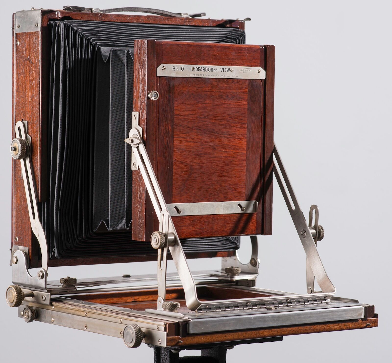
Incredulous, I answered, Directly. How could it be that I had succeeded in creating an identifiable tribute to the black-and-white artist I admire most, to such an extent that another person could accurately divine the source work that inspired it?
When I complimented this keen observer on how improbable his unusual insight was, he explained, My father was the fashion editor of the New York Times, and our home in Manhattan was filled with original Weston prints. This, to me, was an impressive demonstration of the lasting value of a good visual arts education.
Printing Technology and Techniques
Photographic prints have a distinct personality that derives from the artist’s choice of tools and materials. Weston used cameras that shot large negatives, allowing him to make contact prints, whereby the negative is placed under glass, directly on the print paper, before exposure. The resulting prints exhibit incredibly fine grain and sharpness, often better than can be achieved when an enlarger, with its lens and magnification, is employed.
When I began printing color, I purchased a Beseler Dichro 45 Enlarger Head, pictured below left, capable of holding 4x5-inch film, so I could print Ektachrome slides taken with the Deardorff. By the 1980s, I had mostly switched to shooting with Kodachrome 25 film in my 35mm Nikons.
Ilford Cibachrome-A II paper became available in 1982 and allowed for direct printing from color slides in a home darkroom. Soon after, the CAP-40 processor came out, greatly simplifying the photo development process for Cibachrome prints. While it was expensive, and difficult to use due to the lack of contrast or saturation control, the super-high gloss, and azo dyes, of Cibachrome paper made beautiful, dark, stable prints, if the
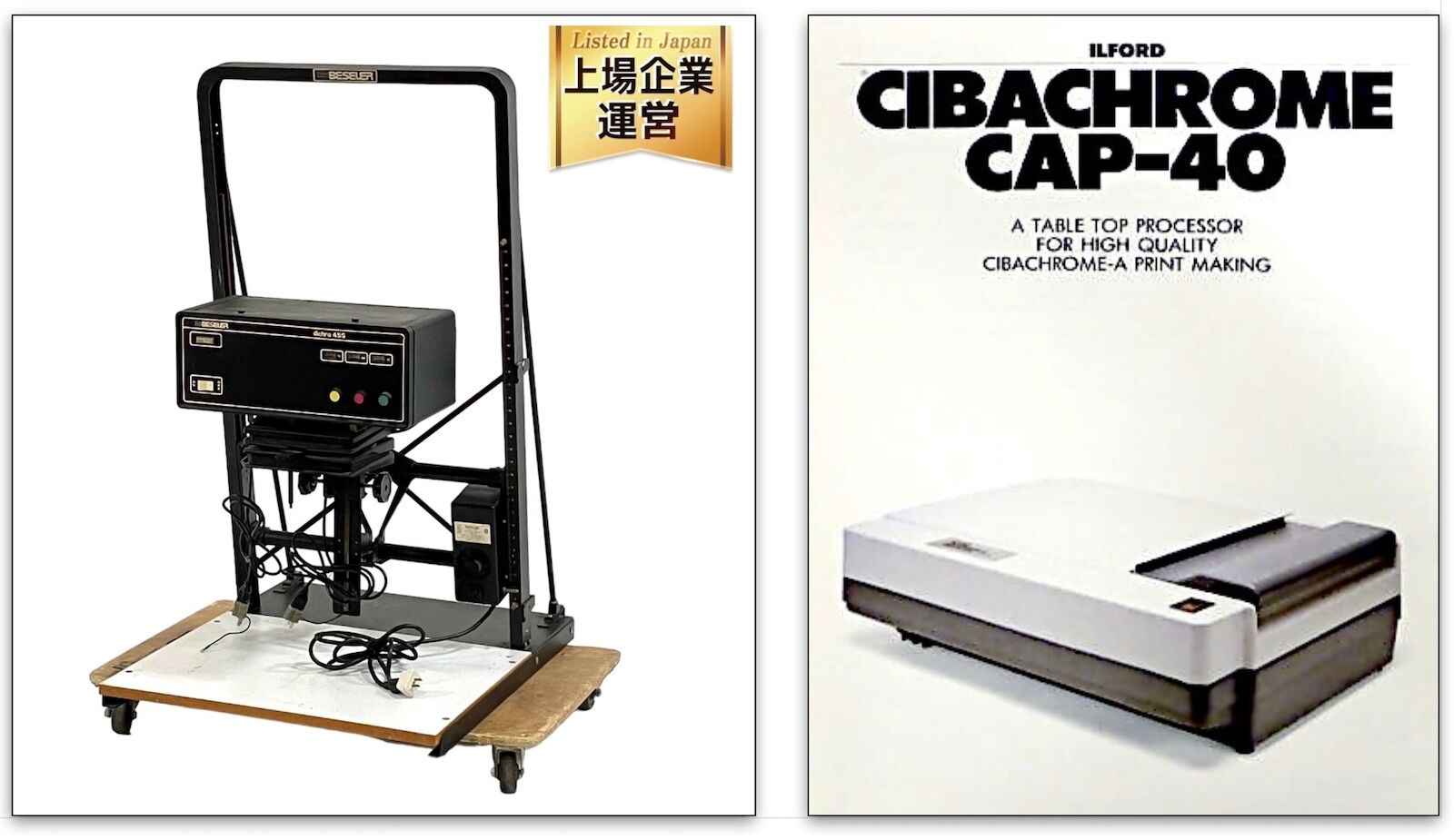
From left: Beseler Dichro 45 Enlarger Head, Cibachrome CAP-40 processor
A Revolution in Color Print Quality and Longevity: Pigment Ink
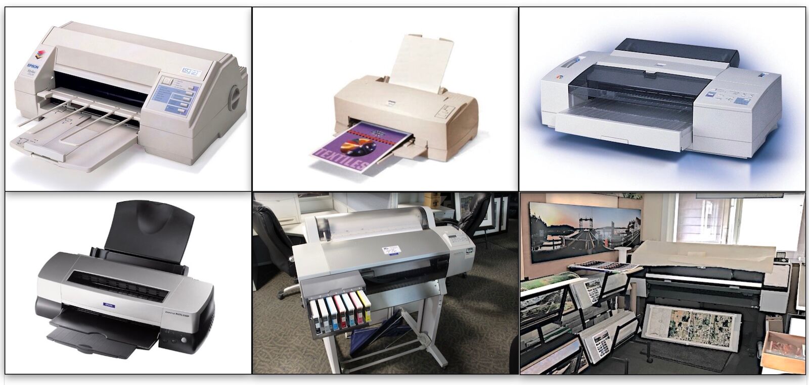
Top row, from left: Epson Stylus Color, Epson 8oo, Epson 3000
Bottom row, from left: Epson Color Stylus 2000P, Epson Color Stylus 7600, Epson 9900/9000
I began printing digitally in 1995, soon after the first affordable ($650) 4-color, dye-ink, desktop inkjet printer came to market: the Epson Stylus Color, seen in the photos above, top left. The Epson 8oo, middle top, arrived circa 1996 and boasted much-improved print resolution but had a voracious appetite for expensive ink! I upgraded to the Epson 3000, top right, in about 1998. It featured 17x22-inch paper handling and bigger ink cartridges.
A significant revolution in inkjet print technology began in 2000 with the release of the Epson Color Stylus 2000P, bottom left, the first fine art pigment-ink printer on the market. While this early version sacrificed the intensity of the yellow ink in exchange for longer print life, the next generation—the 7600, middle bottom—reduced longevity but had a much better yellow. This was my first roll-paper, large-format printer, and with it I began making 18x27-inch prints on 24-inch-wide paper in 2003.
Bottom right is the Epson 9900/9000 (two printers based on the same chassis). I bought one in 2009 and the other in 2016. These machines allowed me to make prints up to 40x60 inches on 44-inch-wide paper. Each printer featured incremental improvements in color gamut (the ability to reproduce a broader array of colors)by utilizing larger, and better quality, sets of inks, up to 11 individual colors from just four in 1995.
What sets pigment-ink-based prints apart from dye-ink output is longevity. As far as modern printing technology goes, no other process produces a longer-lasting print. I can sell my artwork to customers with the confidence that, if framed and displayed with UV filtering glass in a properly lit environment, pigment inkjet prints will last for decades, even centuries, without significant fading.
.
Featured Color Print Artist: Mac Holbert
Optimizing a File to Create a World Class Print with Mac Holbert
Since 1982, I have made thousands of color prints for myself, and many customers. Mac Holbert has printed more than 140,000, if I remember correctly, by 2016. He has printed for many museums and well known photographers like Steven Curry. In 1990, he started Nash Editions with Graham Nash of CSNY.
I had the pleasure of meeting Mac Holbert for the first time at the Palm Springs Photo Festival in 2012. He gave a presentation on color management that I found so much better than any I had previously encountered. There is a PDF copy of his Powerpoint presentation (shared with permission) available in the Publications section of this website.
In 2016, I attended his week-long Photoshop class at the Sante Fe Workshops. I brought several challenging digital files to work on. Mac circulated around the room helping each student with the specific issues they were having with any given file.
Early one morning in 2013, after a walk through the woods, along an old cart path on my family’s ancestral farm in southern Norway, I shot a photo of a group of sheep in the upper pasture. Below is the photo before and after Mac applied a set of adjustments. He greatly improved the image, offering a compelling interpretation that invites the viewer into connection with the photo’s wooly subjects as well as with the soft, rosy-gold light of a Nordic sunrise. The sheep seemed quite puzzled when I spoke to them in my rusty Norwegian!
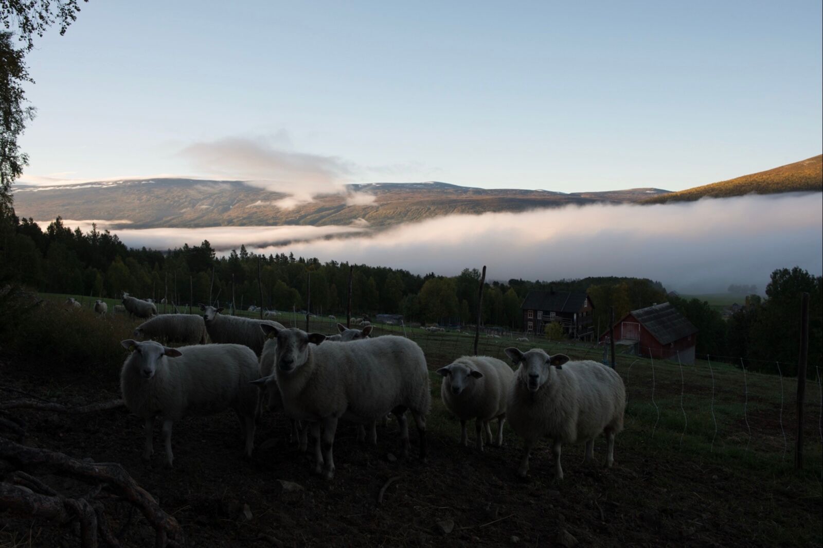
Sheep Pasture at Fjellstad, Peter Fisher, 2015, unaltered image
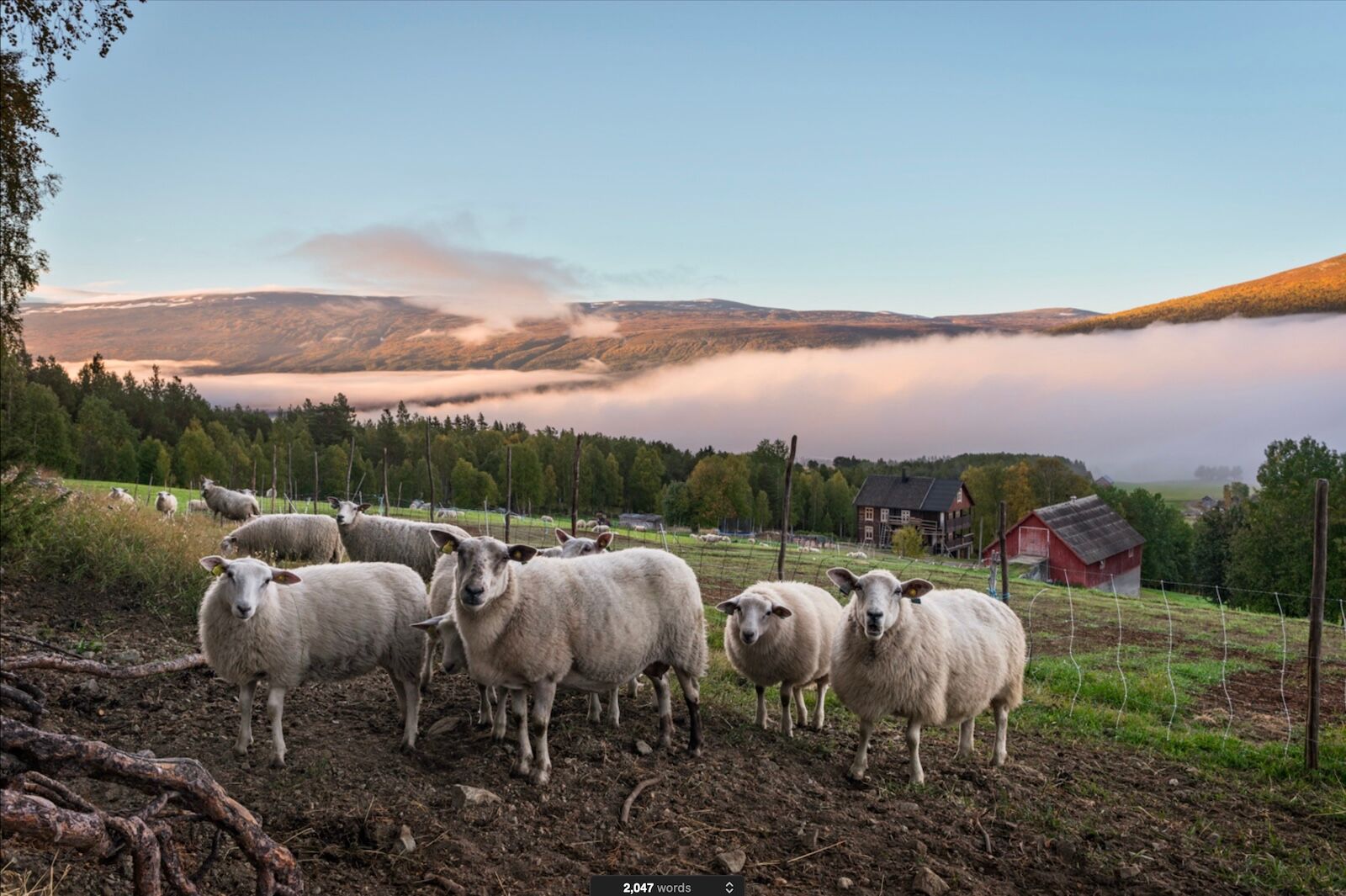
Sheep Pasture at Fjellstad, Peter Fisher, 2015, adjusted image
[Alternative layout idea below. Too small?]
Almost every image benefits from the creative transformation of a raw file into a work of art on paper. Exposed on Kodachrome 25 slide film, the portrait below was scanned with my Imacon 848. Mac’s ingenious and tasteful improvements emphasize the lush primary colors that contrast with Giselle’s somber, hypnotic, faraway gaze.
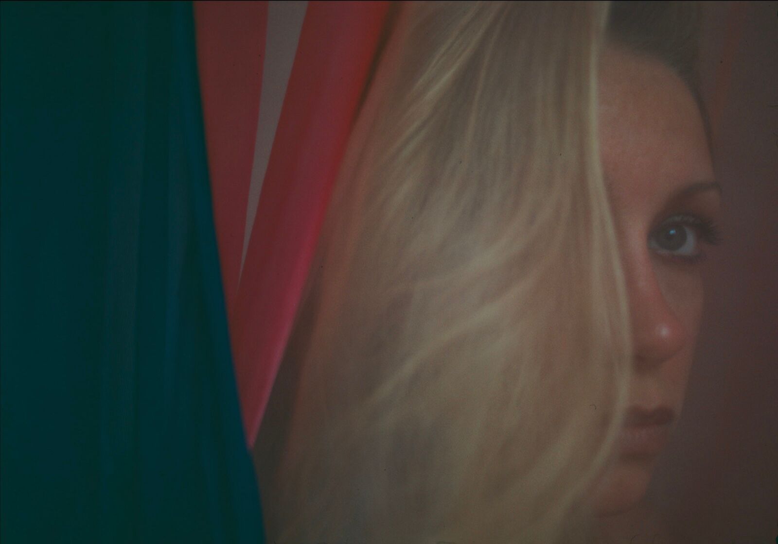
Giselle Portrait with Fabrics, Peter Fisher, 1979, unaltered image
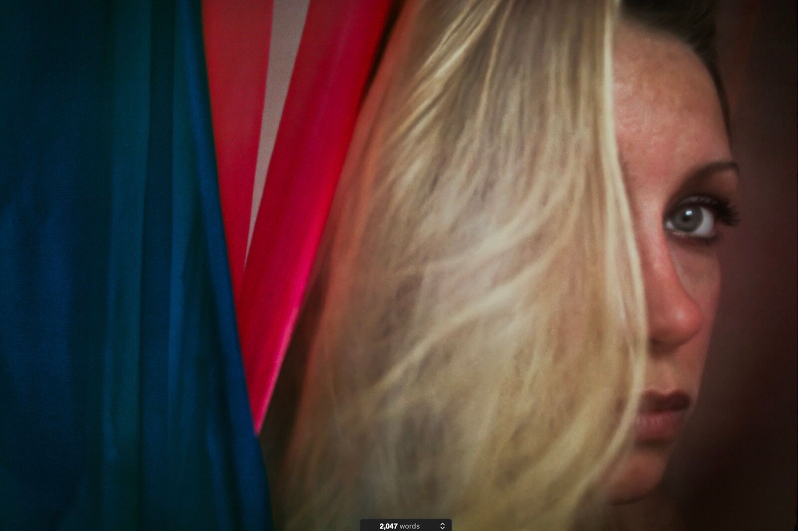
Giselle Portrait with Fabrics, Peter Fisher, 1979, adjusted image
I took the portrait of my son, below, with my Nikon D800 the first day we were in Norway for a visit in 2015. Mac worked his artistry again on the raw file, balancing the exposure and bringing out the warmth both in Will’s face, and on the hills beyond. Nothing like a brisk hike in the Norwegian mountains, high above the Hallingdal Valley, to bring a smile.
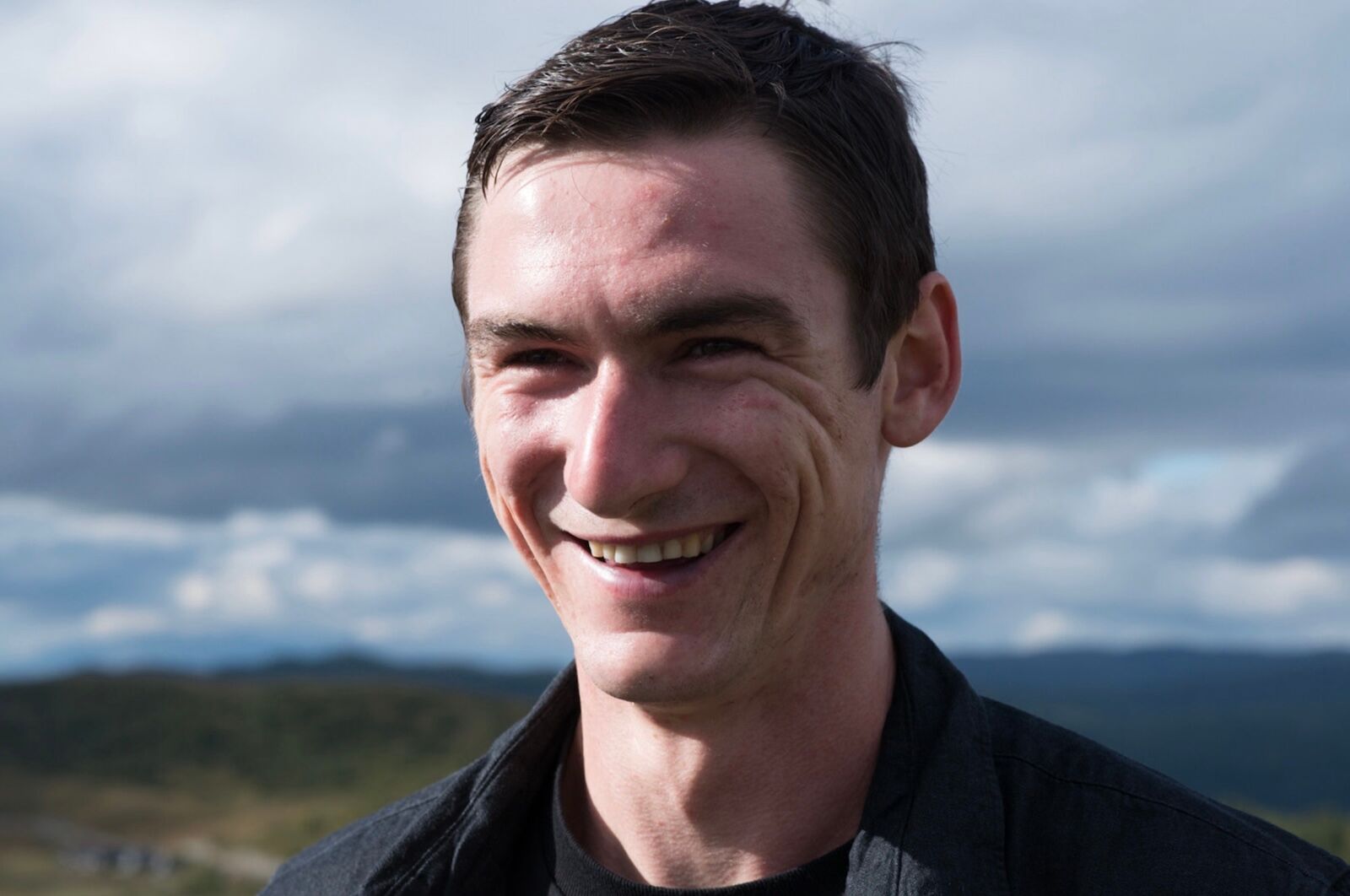
Will Portrait, Peter Fisher, 2015, unaltered image
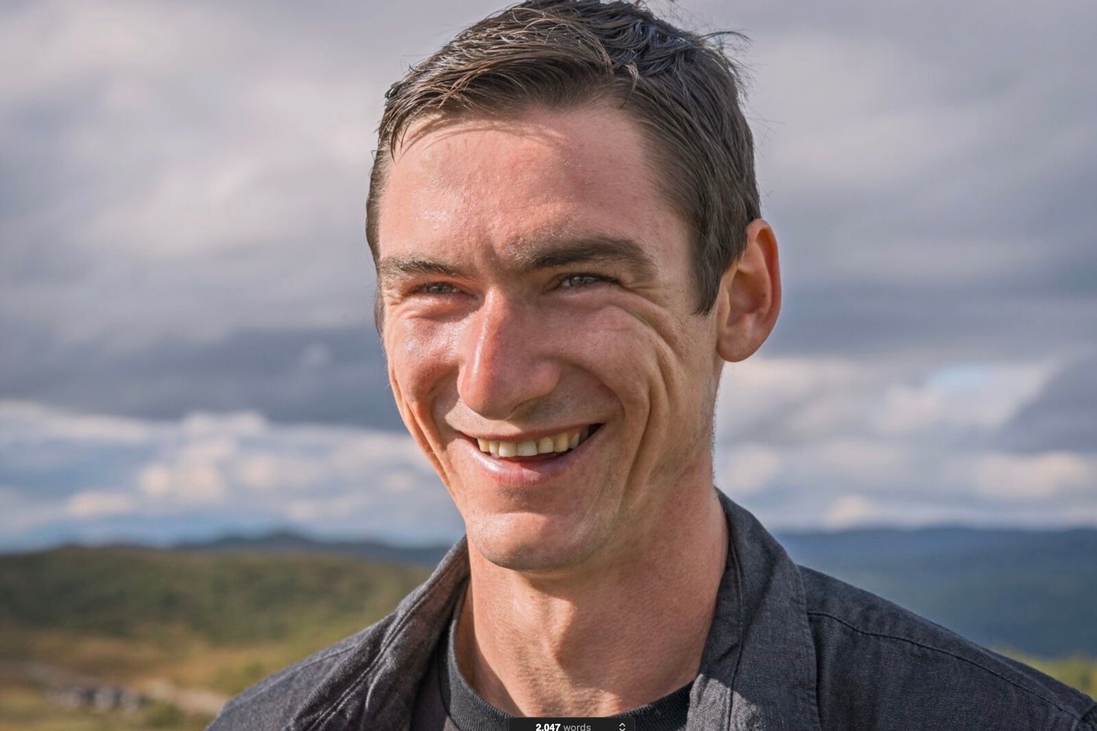
Will Portrait, Peter Fisher, 2015, adjusted image
.
Two Examples of Kodachrome Slides Printed with Three Different Methods
The image below is my top-selling photograph, Charolais, Driftwood Ranch. The top left version, from 1986, is a 6x9-inch Cibachrome print. It suffers from being a bit too dark, yellow, and green. The top right image is from a Nikon 4000 scan and Photoshop adjustment in 2003 from which the image emerged too blue and too light.
The bottom image was made in 2015 from an Imacon 848 scan that produced a 500MB file, good for prints up to 40x60 inches. After 20 years of practice, I finally had enough skill with Photoshop to achieve this result, balanced in color, contrast, and bathing its subjects in, to my eye, a sublimely beautiful quality of light.
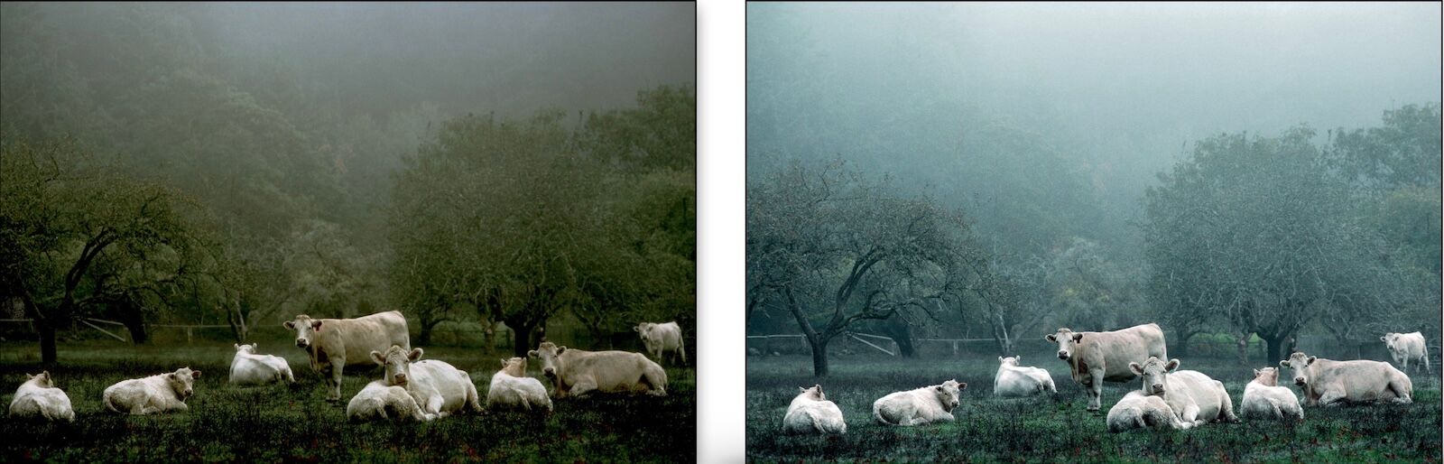
Charolais, Driftwood Ranch, Peter Fisher, left: 1986 Cibachrome print, right: 2003 Nikon 4000 scan and Photoshop adjustment
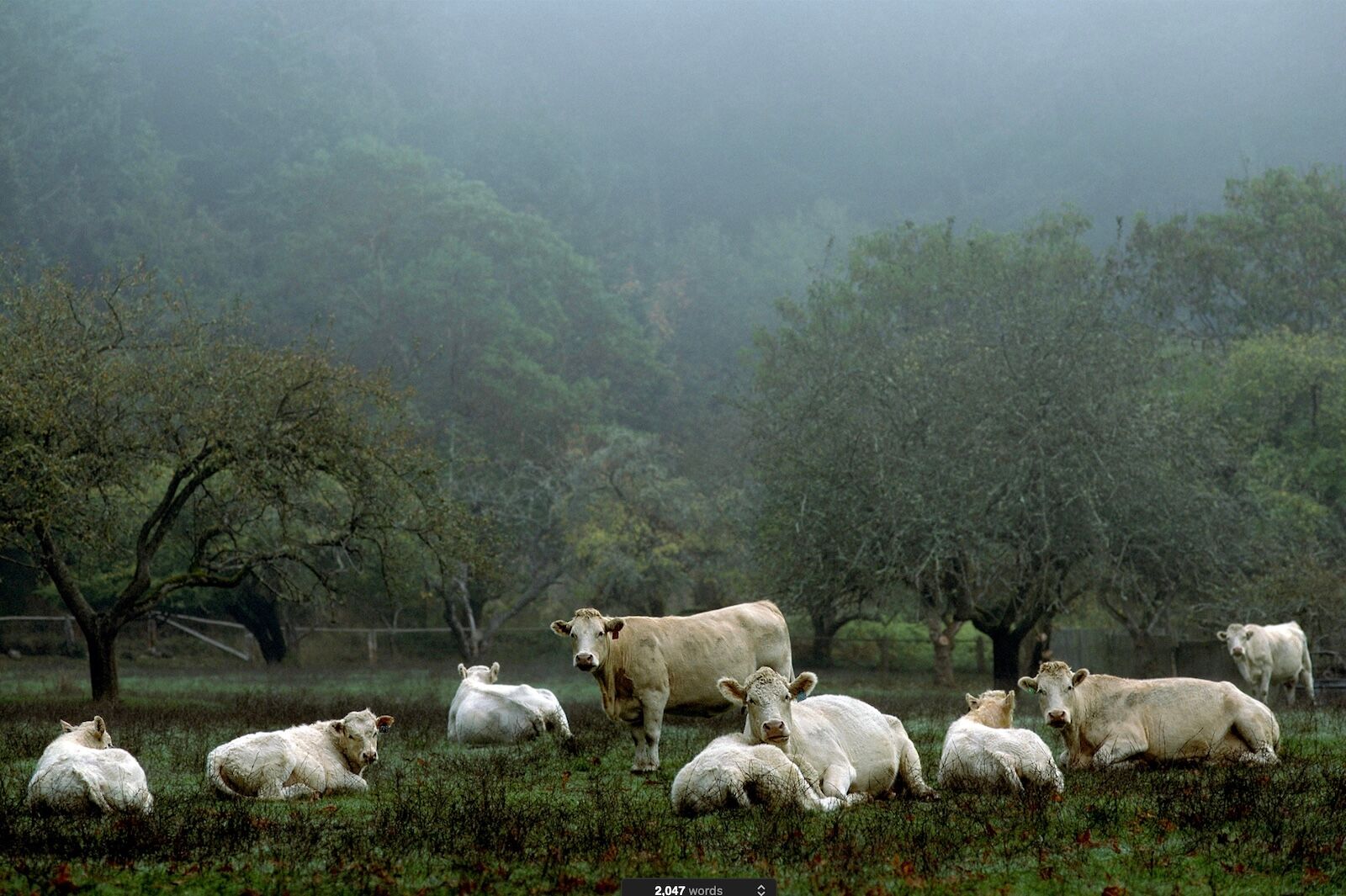
Charolais, Driftwood Ranch, Peter Fisher, 2015 Imacon scan and Photoshop adjustment
.
Second Example: Evolution of the Photograph Madrona Grove at Sunset
Below is my second best-selling image, Madrona Grove at Sunset. It was taken with Kodachrome 25 slide film in 1988. The top left image is a scan of a glossy Cibachrome print from 1990. It is color biased towards yellow, which made the blues a bit greenish.
The top right version is from a 2003 scan made with the Nikon 4000. It is much closer to the original slide, though this rendition is still yellow biased and the blues have a magenta tinge. In 2015, working in Photoshop with a high resolution Imacon scan, and patience, this evolution conjures a luminous recollection of that moment.
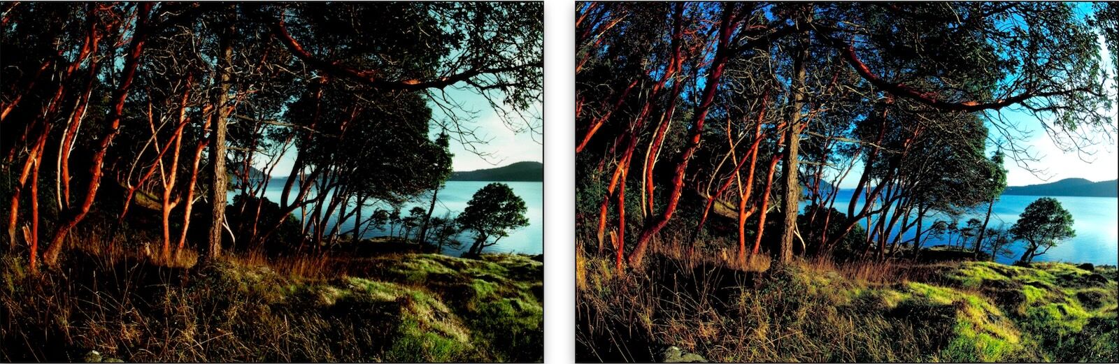
Madrona Grove at Sunset, Peter Fisher, left: 1988 Cibachrome print, right: 2003 Nikon 4000 scan
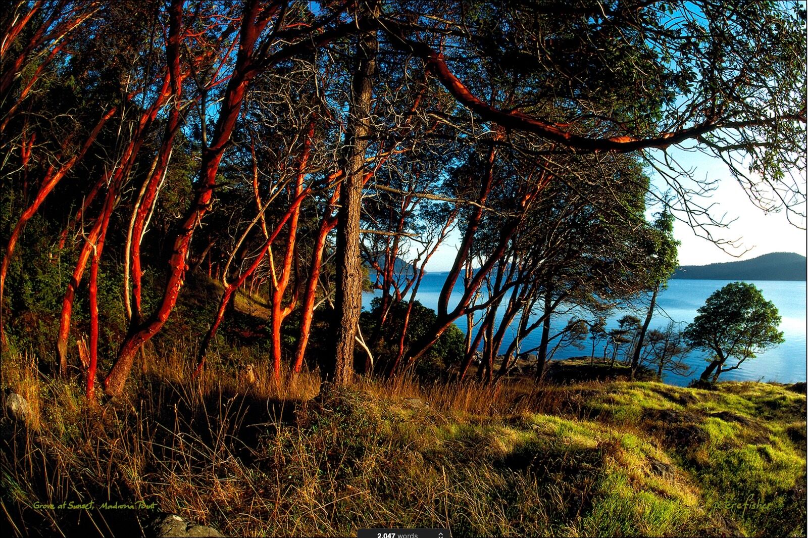
Madrona Grove at Sunset, Peter Fisher, 2015 Imacon scan and Photoshop adjustment
I’ve found my 30-year odyssey of learning digital printing highly rewarding. This relatively new technology is a truly revolutionary improvement in color printing.
.
Adobe Camera Raw: My Favorite Tool for Transforming Raw Files into Prints
There are still times when color correction in Photoshop is necessary, but these days I mostly import raw files and jpegs into Adobe Camera Raw, then export them into Photoshop as a Smart Object to make final changes, such as cropping and sizing. Smart Objects can move backwards into Camera Raw, if necessary, for more work. Lightroom has a similar export-to-Photoshop feature.
You can see the changes to tonality, color, sharpness etc. that I made to the image above in the illustration below. The before-and-after comparison views are helpful!
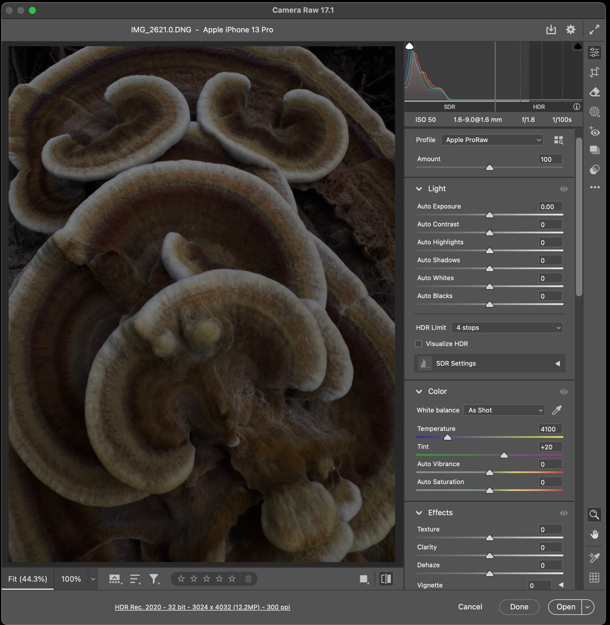
Mushroom, Peter Fisher, 2025 raw image, unaltered
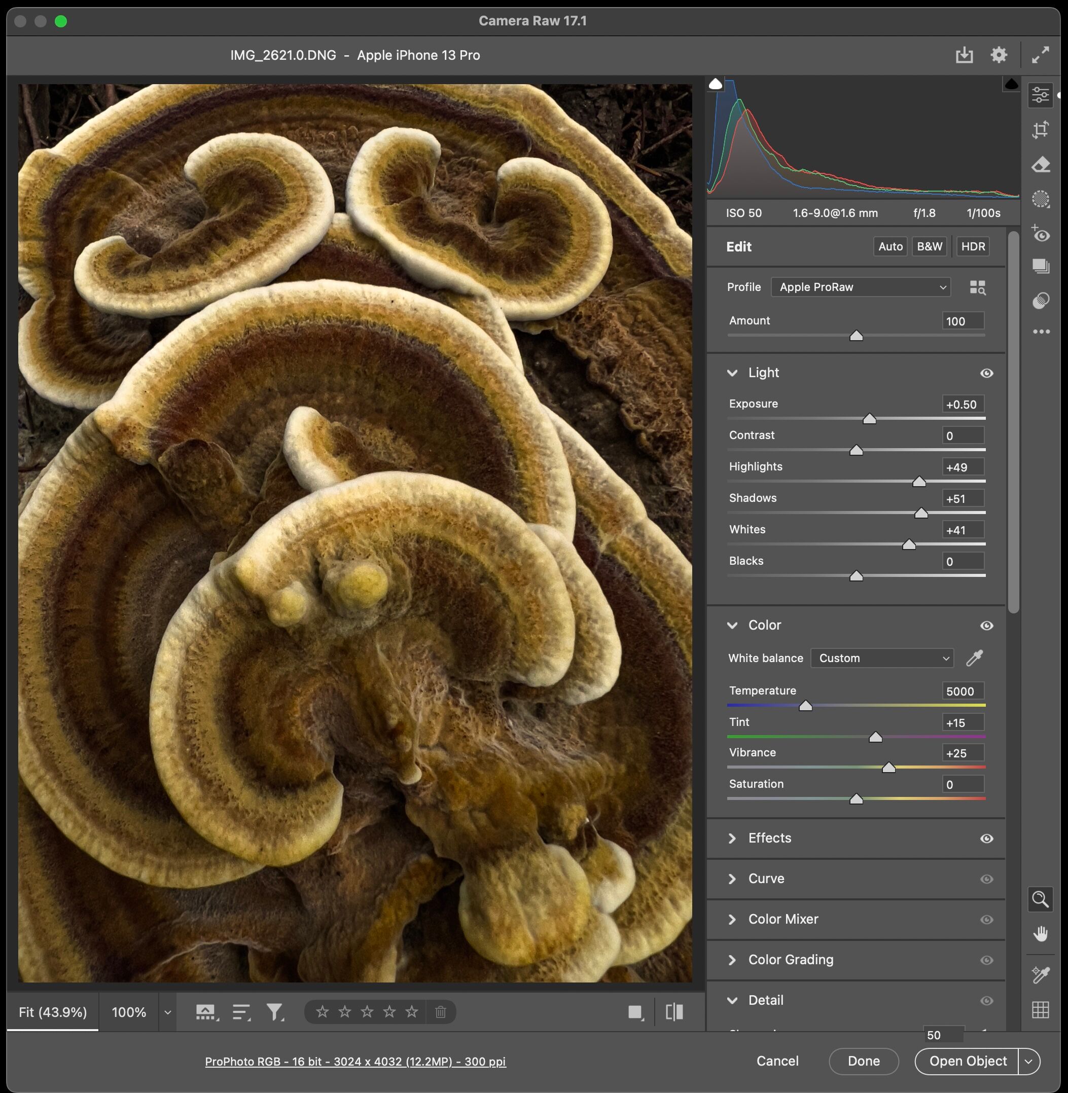
Mushroom, Peter Fisher, 2025 Camera Raw adjustments, Step 1
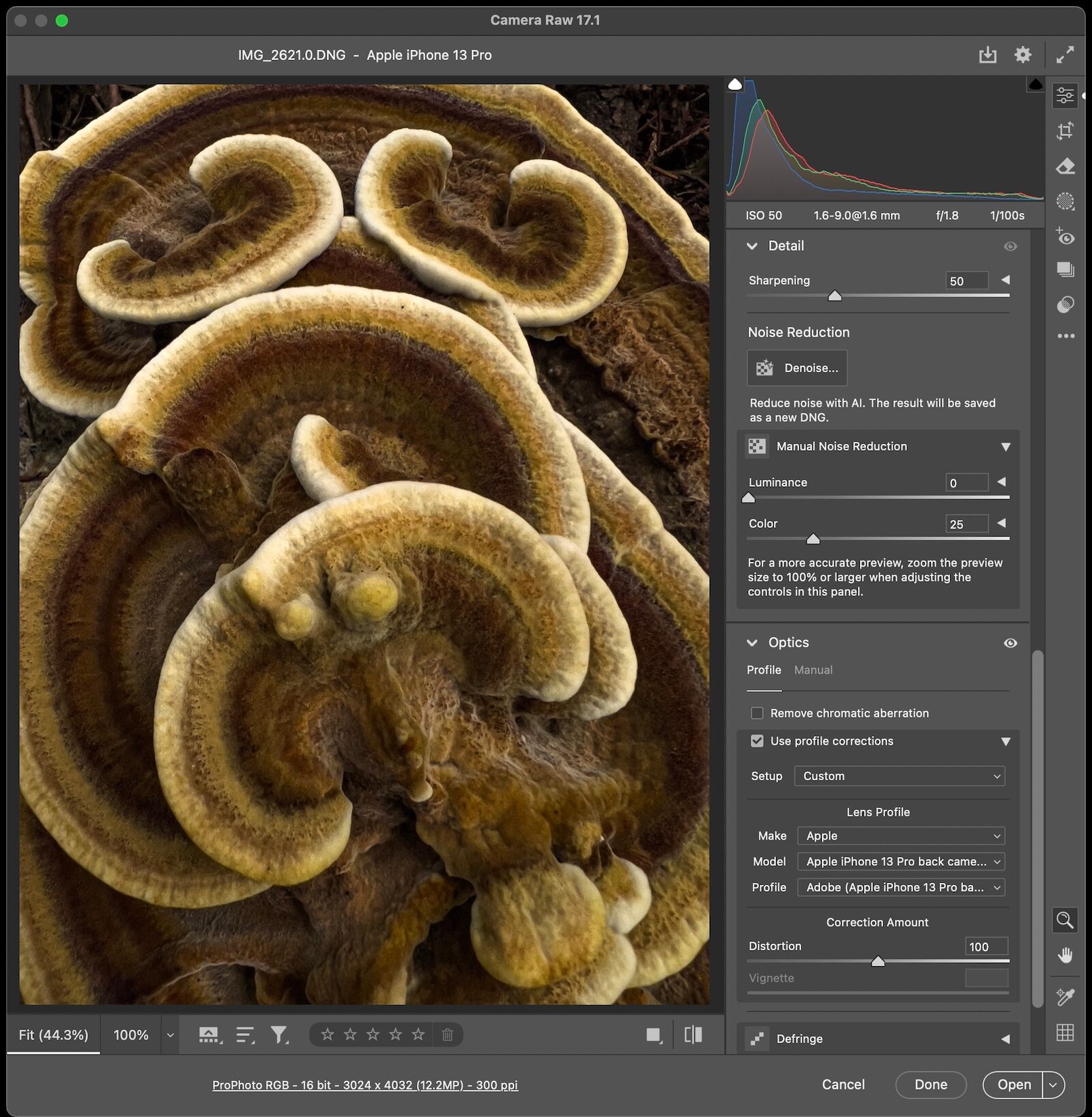
Mushroom, Peter Fisher, 2025 Camera Raw adjustments, Step 2
I often adjust iPhone photos with the built in tools at the time of shooting. This permits edits by comparing the raw file with actual, physical reality. These images of Eric Lum show how modest changes made to color and contrast, and the use of sharpening, make for subtle but noticeable improvements to the original raw file. Go out and play. And, if you visit Orcas Island, don’t miss the Lum Farm Store.
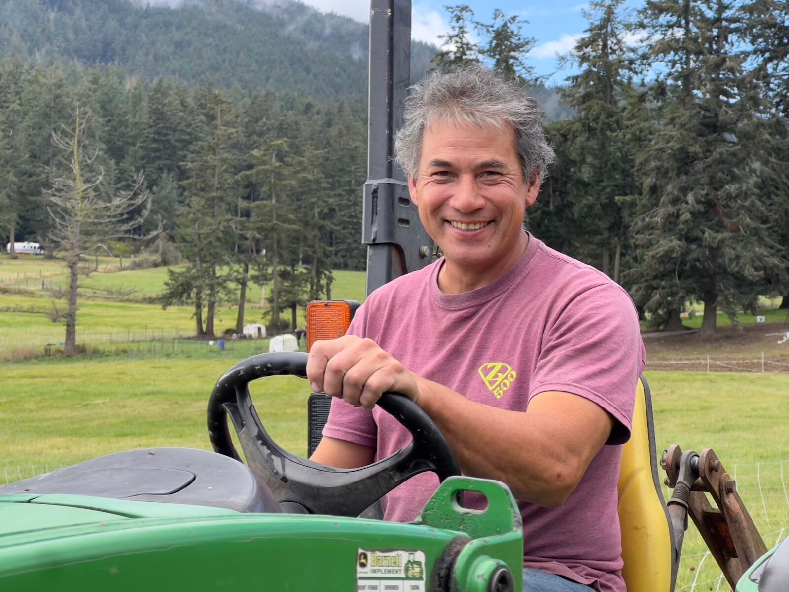
Eric Lum, Peter Fisher, 2024, raw image
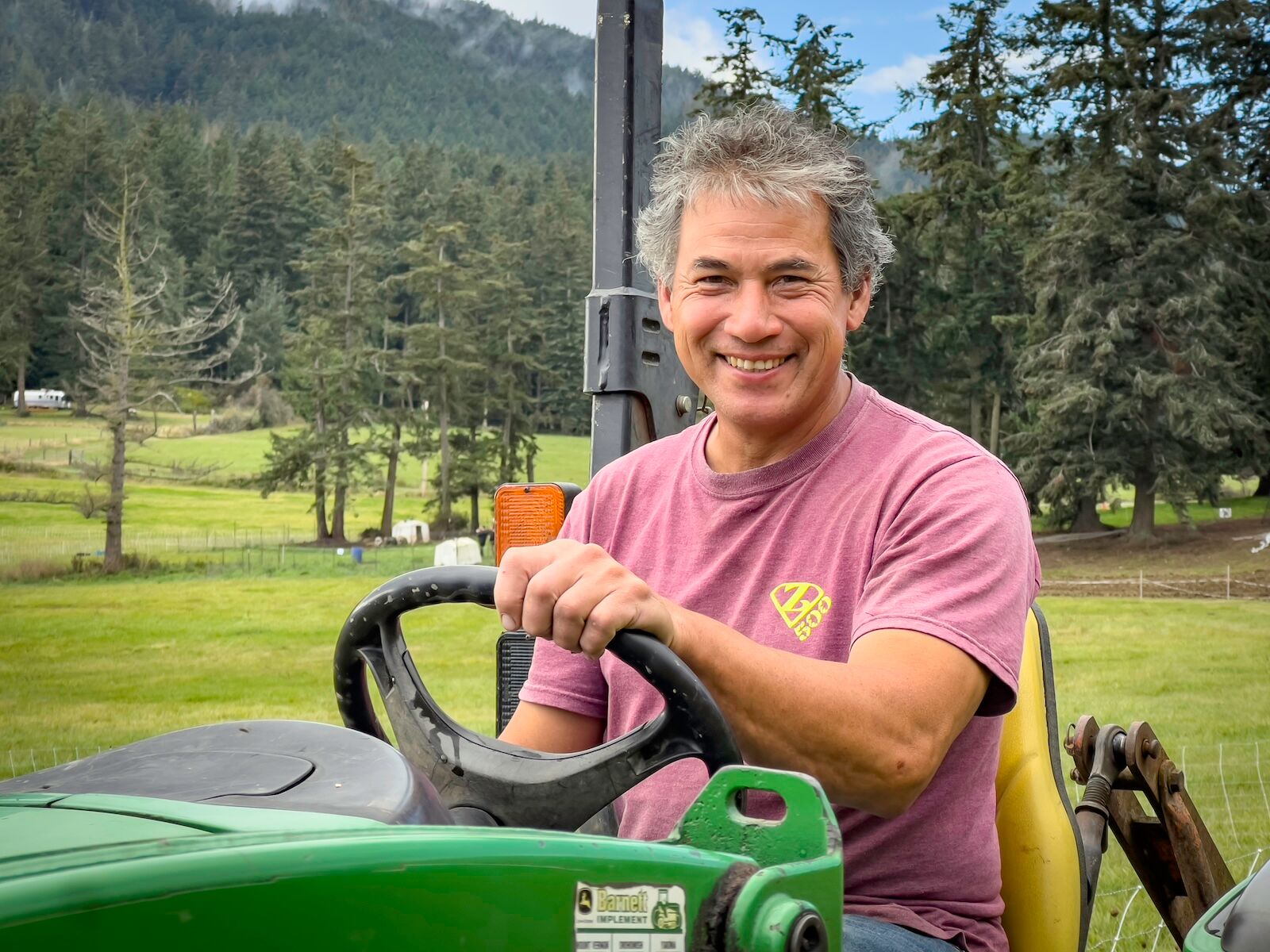
Eric Lum, Peter Fisher, 2024, adjusted image
.
Links related to content in this article:
1. Listen to “The Best of Louie, Louie”:
https://youtu.be/g21H3wU3Ihs?si=1unJT9SLVuhAncsY
2. Information on Edward Weston:
https://www.edward-weston.com/edwardwestonhttps://www.theartstory.org/artist/weston-edward/
3. Deardorff Cameras:
https://www.craigcamera.com/deardorf.htm
https://www.largeformatphotography.info/deardorff/
4. Beseler Enlargers:
https://www.bhphotovideo.com/c/product/3991-REG/Beseler_8227_45MXT_Enlarger_Chassis_Only.html
https://www.beselerphoto.com/light-sources/
5. Mac Holbert:
https://photography.org/interview-mac-holbert